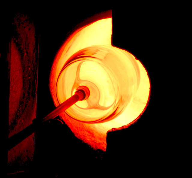
Basic editing, exposure, brightness and contrast, saturation. I went to a glass blowing company they were makeing these large glass bells so i just started shooting as they were doing their thing. lighting wasnt the best but i worked with it the best i could. i used a low shutter speed with 400 and 800 iso 4.5 aperture i think a higher shutter speed would have been better to cut down on the blur cause they were moving around alot. my second challenge hope everyone likes.
Statistics
Place: 50 out of 258 Avg (all users): 5.7869 Avg (commenters): 6.6875 Avg (participants): 5.7212 Avg (non-participants): 5.8235 Views since voting: 1178 Views during voting: 407 Votes: 291 Comments: 18 Favorites: 0
YOu have an original take on the Challenge that was quite well rewarded by our voters. Composition is excellent; technique, as far as I can tell, is just fine. My first impression on seeing the shot - and this is important, I suppose for our fast voters - was that the shot was a little hot.
But then, I stopped to think, "well, yeah! It's likely to be a little hot isn't it! How many degrees is that furnace, anyhow?"
So, the only offering I have to make is one you probably have already thought of: Bracket those shots. Try different ISOs, try different apertures, etc. etc. Experiment.
Oh, heck. You're doing fine. Keep up the good work.
A shot with some great potential. There are some strong, compelling colours here.
There is also some darker red happening over on the left, and I wonder if the shot would have gained from having this more involved in the composition. Maybe if you'd aimed for a less square aspect-ratio, and introduced more of the darker red on the left, with the pipe as a compositional element to lead us from the left towards the furnace on the right...
Quite a symbolic image. It has a duality to it: light/dark, hot/cool, negative/positive. The image is really quite simple with high contrast in content. Not sure how it might compete against images with richer content, but it does the job and stands alone. Sometimes putting images like this into competition seems to reduce their worth somehow...
A few things might strengthen this good image this slightly - Taking the photo from slightly higher would allow the rod to come from the bottom left corner whilst still vertically centering the oven; cropping more tightly on the right would put the vertical of the oven on a 3rds line; mirroring the image would give you the letter D, matching your Diablo theme.





 Add photograph to your favorites
 Add photographer to your favorites

 Photographer found comment helpful.


