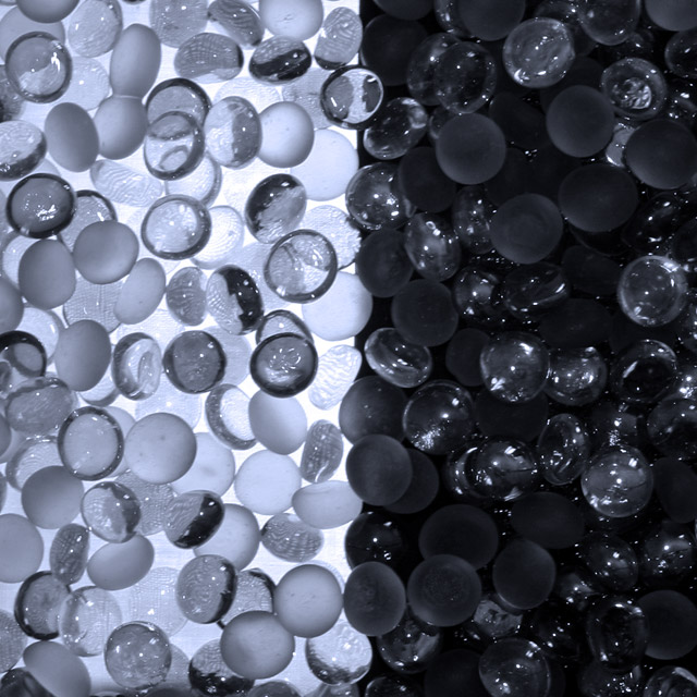
There's a lot I like about this shot. The mix of clear and frosted glass, allowing for transluscence, refraction and reflection to all feature. The strong contrast between left and right. The way the refraction allows light to travel into the "dark" side, and vice versa.
But does it need to be so nearly symmetrical? And vertical? And square? Maybe you tried other positioning, and it didn't work so well...
I think that if the division between light and dark was angled, this would be a more interesting shot. could be a bit sharper but it seems as though this is on the edge of becoming grainy
Hard thing to expose correctly without losing detail or blowing highlights. The white side looks just a bit bluish gray in the background. It does make for an interesting abstract.





 Add photograph to your favorites
 Add photographer to your favorites


 Photographer found comment helpful.


