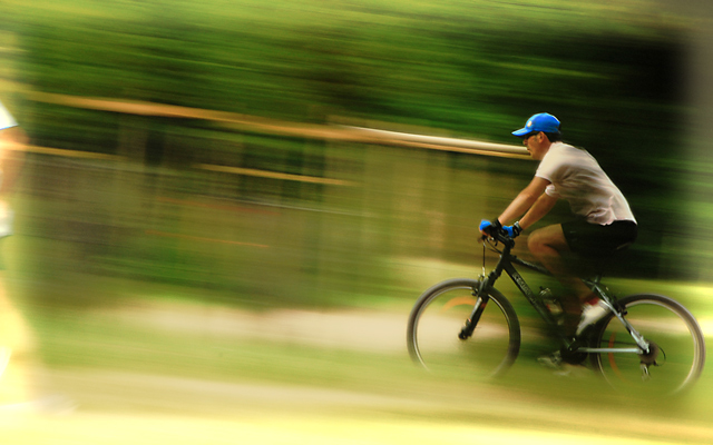
I see now reason for this to have not ranked much higher. I had given it a 10, liking not only the overall image, but the bright colors, composition and perfect blur. UGH - voters just don't get it do they?
Your technicque is excellent, you have done an excellent job of panning the action, composition and exposure are spot on. Excellent.
You have received some useful comments during voting. I have to agree that the angle isn't steep enough to look deliberate, maybe add 5 degrees.
I see what you were trying with the runner but for me it doesn't quite work, he is just to far out of the frame.
The soft frame does not add much to the image either.
Overall a great photo, one of the best panning entries IMO. This is reflected in the voting which has given you a reasonable score.
You obviously have great ability, I would love to see you go back and re-shoot the scene. It wouldn't to much to make a top image.
Thank you for all the great comments. I don't have this technique totally clean yet but the score is better than expected. So it's really encouraging. Most found the left blur of the runner in front distracting but it was part of my composition and hence, the title. I wished I had been able to capture him more within the frame but he was too fast. Also, the original was strictly horizontal (as digitalknight suggested) but I found it too flat. Tested a few tilt angles and found this was best IMO (but maybe not). Appreciate all the feedback tho' (yes including yours MPRPRO). :)
Really nicely captured. This being Advanced Editing, I would crop off the object near the left side and just slightly selectively darken the bottom bright yellow streak a bit. Great job overall :)
Yawn...I know I saw this before...going the other way. Title should be Dejavu.. did I spell that right?
Honestly on it own it isn't very good in post. The image is sharp on the rider which is good, but the vignette is a bit too much as a border. Just my opinion and we all know about those so don't be upset with me.
pretty - would like to see either no angle (strictly horizontal lines) or more angle. This 5 degrees (or whatever it actually is) seems too little for my eye, and feels like an oversight. 6
I really like how you blurred the background instead of the biker but this shot may have looked better if you had cropped out the arm and leg on the left.
A truly captivating image. My only concern is that portion at the extreme left of the image which I personally would have cropped out as I find it distracting.
This image should fare very well in this challenge. Good luck.
Nice how the jogger is almost out of the frame. Perfect blur. The blue of the guy's hat and gloves really makes the shot. Well composed and executed. 10





 Add photograph to your favorites
 Add photographer to your favorites

 Photographer found comment helpful.


