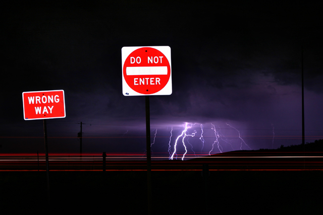
This is a great shot. I like the unique twist on the ole Lightning shot. Not sure if the car light streaks add much to the image though then again they do help the signs post stand out and not blend into the dark background too early.
I think there is too much here competing for the attention of the eyes. Theres not much of a central focal point. The picture is also unbalanced with the two signs being so prominent on the left.
this has everything ... really amazing - Looks like you had a light illuminating the signs and then kept the sutter open for the otehr stuff. Excellent. A slight composition change would put this way over the top. 8
Nice capture of the lightning. The car lights are interesting too. The picture just seems too dark overall --or the lightning occupies too little of the space in this image. The road signs are a bit distracting too. Again, though--nice capture on the lightning.
It was great that you had the guts to include the signs. It really adds narrative. If this doesn't ribbon, it is because the motion is not as prominent graphically as the other elements. Great job. 9
this is a slightly unusual composite of subjects, and i think it's slightly bursting with too many good ideas... the capture of the lightning storn is very successful and dramatic, but the impact is lessened due to the signs which admittedly serve a purpose in context, but not to the benefit of the shot. also the motion blur is incidental, rather than integral to the picture. i think voters, myself included, generally likes a bit more emphasis and obviousness with regards to that sort of thing. 6.




 Add photograph to your favorites
 Add photographer to your favorites


 Photographer found comment helpful.


