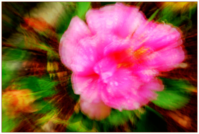
Didn't get round to leaving a comment during challenge but I did like the idea of this a lot. Just found the colours overly saturated especially on the red. Gave it a 6.
I've given the same basic comment on quite a few shots -- my preference (as I discovered while looking at a number of these blur shots) is for a sharp subject. When there is no sharp subject, my eye wanders around trying to find something to focus on. Perhaps just a difference in artistic preference.
This is almost more digital art than digital photography...not necessarily a bad thing at all. This is mostly a study in color and shape, and while most everyone would recognize the flower, it is not a typical flower portrait by any means. The colors are amazing, and there is a lot to look at. Good luck.






 Add photograph to your favorites
 Add photographer to your favorites

 Photographer found comment helpful.


