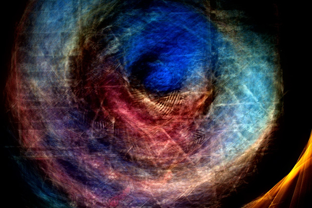
I pointed my camera at a wall hanging of a kimono and with a long exposure rotated the camera so as to destroy the literal representation but retain the colors in a blurred circular pattern. After making the shot I used the following postprocess: Levels, Contrast/Brightness, Neat Image and USM. It took three shots to get the timing and rotation the way I wanted it to make a usable image.
Statistics
Place: 112 out of 177 Avg (all users): 5.1140 Avg (commenters): 6.2857 Avg (participants): 4.9079 Avg (non-participants): 5.2479 Views since voting: 1305 Views during voting: 354 Votes: 193 Comments: 25 Favorites: 3 (view)
Hey, I added this to my favourites straight away even though I didn't have time to comment. This is my favourite of your entries so far, even if not the highest scoring. ITs a beautiful abstract, I love the rich colours and the clarity/sharpness of the patterns in a kinda cubistey way, rather than everything being completely blurred.
Not sure what I could suggest to improve it... possibly (although I know its partly trial and error) it may have been better with more of the yellow bit, which gives it more of an eye/seashell shape rather than the more circular shape.
Definitely underrated, but you can pretty much expect that for an abstract here. You should be very pleased with it nonetheless
First, I apologize, as I missed this when I went through earlier this week to comment - I tend to forget the challenges I didn't enter or vote in. Second, this won't be a totally unbiased comment, since I found out I missed this by reading a comment you made in a forum thread. All that said... I do like this. I'm not generally a fan of abstracts, but I do like a good one now and then, and this is a good one.
With a lot of abstracts, I find myself compelled to figure out what it is - I don't seem to need to do that here. I like it as is, without worrying *what* it is. And contrary to some of your comments, I do like the gold in the corner - adds a spark that lights this up. I'd say this is a very successful experiment!
OK - So i gave you a pretty detailed comment from the trading post. And after reading that comment again it pretty much stands the same. I am not quite sure how to go about returning this to the pile to be commented on so what I will do is ask one of my friends to give you a comment on this as a replacement. Let me know if thats not cool and I will see what I have to do to get you back in line.
Tim
(copied just in case CC management looks to see if I did my job)
OK - as an abstract I think this shot works very well. Cool colors and textures. The yellow on the corner though should either be gone or have more of it. I see the little bit of it and want to see more of it. It has a contrasting look and feel to it compared to the rest of the pic. I had absolutley no clue what this was a picture of. But for the challenge it was tough to vote this high IMO. I personally felt that you needed to understand what the subject was to be able to relate to the movement. Spending more time looking at it now makes me feel that I may have scored it a bit harshly, but in the DPC voting world where you spend all of a second or two glimpsing at a shot this didnt grab me or make me want to stay to inspect it further. At voting time I thought it was not interesting or relevent as a motion blur shot. Looking at it deeper now and reading your description I can see what you were shooting for but I still think it would have done much better in an abstract challenge.
Trading post...
For the picture...I love this, but then I tend to go for abstracts with lots of color. The textures are fantastic. The one thing I don't like is the fiery yellow burst at the bottom right. If you cloned this out it would make a wonderful print.
As for the challenge, I didn't vote this one but it wouldn't have gotten a high score as it doesn't portray a "something" with motion blur.
Trading Post - OK - as an abstract I think this shot works very well. Cool colors and textures. The yellow on the corner though should either be gone or have more of it. I see the little bit of it and want to see more of it. It has a contrasting look and feel to it compared to the rest of the pic. I had absolutley no clue what this was a picture of. But for the challenge it was tough to vote this high IMO. I personally felt that you needed to understand what the subject was to be able to relate to the movement. Spending more time looking at it now makes me feel that I may have scored it a bit harshly, but in the DPC voting world where you spend all of a second or two glimpsing at a shot this didnt grab me or make me want to stay to inspect it further. At voting time I thought it was not interesting or relevent as a motion blur shot. Looking at it deeper now and reading your description I can see what you were shooting for but I still think it would have done much better in an abstract challenge.
IMO it was worth the experiment! I had to come back to see what it was all about. I like the colours a lot. Keep up the good work and forget about the scores... ;-)
Interesting set of comments. Some people loved it. Others were intrigued but puzzled. And still others didn't know what they were looking at and couldn't figure out how I blurred the image (apparently scoring it low). Since explanations are not allowed during voting there is nothing I can do except put a title like "Rotating motion to create blur" or some such thing. "Eye of God" is so much more interesting. Ultimately, I do this for my own enjoyment. Some may like it. Some may not. I appreciate the comments of those who were challenged by this image...and acknowledge the comments of those who felt otherwise, but still were willing to leave a comment. Thanks to all.
To judge the quality of the motion, I need to know what it is that is moving. I haven't the foggiest what your subject is here. I like abstracts, and the color and texture are nice, but I have no idea what I'm looking at.
I really like this photo. It is an abstract and I can't seem to catch the motion here, but it's good enough for me to give benefit of doubt.
I'm hoping your notes will explain a little. Meanwhile, congratulations on a well done shot.
I've given the same basic comment on quite a few shots -- my preference (as I discovered while looking at a number of these blur shots) is for a sharp subject. When there is no sharp subject, my eye wanders around trying to find something to focus on. I also don't tend to be attracted to shots where I can't tell what I'm seeing. I find myself trying to figure out what this is (and being frustrated when I can't) rather than appreciating it as abstract art. Perhaps just a difference in artistic preference.
Love the colours, like the abstract nature of the image, but have not got a clue as to how to vote on this with regard to the subject being motion blur. So, for the time being, am only leaving a comment, no vote. I might come back later and edit and leave a vote. == OK, came back. I am hitting the vote button. The image colours and design are far too rich to ignore. 9.
I love this image so much. It looks more like a painting than a picture, and I keep coming back to try to find out what I actually see. I do think that this is a tough picture to sell here on DPC though, not everyone is into abstracts.






 Add photograph to your favorites
 Add photographer to your favorites

 Photographer found comment helpful.


