|
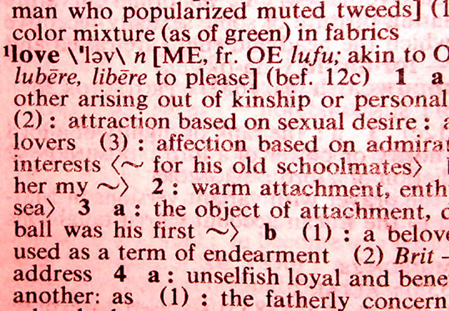
Creative take on tools. Points for the idea. The image itself is hard to look at - very busy and overdone. You have several things happening here - pink colour cast (unless you have pink dictionary), text out of focus and probably sharpening attempted, so it's thrown out of wack. Also very close crop makes it even more busy. |





 Add photograph to your favorites
 Add photographer to your favorites


