Explanation: With any image I rate that receives 3 or under, I will explain my reasons.
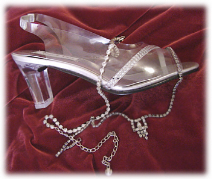
Lighting: For me, the lighting is too harsh. The flash in the reflection is where my eye is drawn.
Focus: There's seemingly no particular point that is in focus. Every edge seems blurred, some more than others. It also looks like some places were artificially blurred in post-processing.
Creativity: The idea was good, stringing some jewelery around effectively paints a picture of something more than just a shoe.
Aesthetics: All of the above comments are responsible for the lack of aesthectics for me. Also, the crop doesn't work for me. The area everything is placed seems off. The white faded framing also distracts. Some people might like that kind of thing, but I don't generally like any kind of boarder when trying to rate a photo, and it will always detract from the overall quality for me, as I rate purely on the photo itself. 95% of the time a boarder of some kind will lose 1 point for me. It's a good idea overall, but a larger image size would help, as well as making sure everything is in focus. Try a larger aperture, and bouncing your flash off of something else, or if you can use some studio lighting.
If I were to be picky, I'd say that the shoe is plastic, not glass. I like the backdrop fabric. Picture size is smaller than the max 640 pixels on one side that's allowed.
I think it hurts you that this looks like plastic not glass. even though you want the viewer to believe it's glass, not taking a photo of plastic was probably a bad move for your score. harsh lighting too. nice composition though.







 Add photograph to your favorites
 Add photographer to your favorites


