The shot:
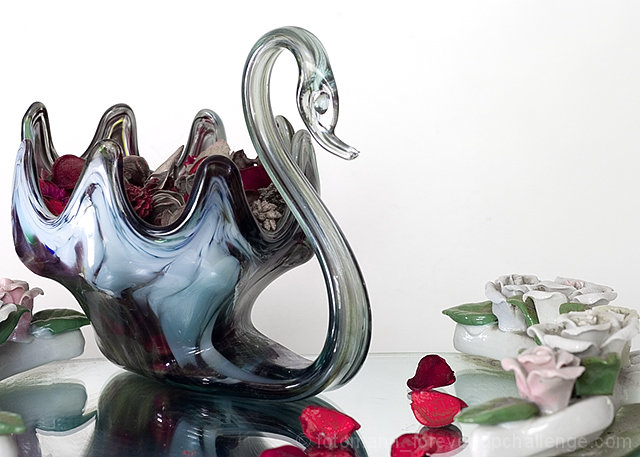
Set up on white glossy poster paper. I lit the shot with on-camera flash bounced off a silver reflector. A slave bounced off white paper was used to light the background. Shutter speed was set slowish to allow some ambient light from Window light to spill into the scene.
That mirror is not a good mirror, it distorts reflections horribly, but I like the effect here.
Post-process:
Convert from RAW - CRW_9441.crw
Crop
Levels to bump up whites
Cureves - mild s-curve
Hue/Sat lightened "Red 2" channel to get rid of a little shadow behind the swan.
Flatten
Smart-sharpen
Resize - Bicubic smooth
Smart-sharpen
Save for web
Statistics
Place: 98 out of 258 Avg (all users): 5.3011 Avg (commenters): 6.0000 Avg (participants): 5.0435 Avg (non-participants): 5.4278 Views since voting: 984 Views during voting: 353 Votes: 279 Comments: 14 Favorites: 2 (view)
Leroy, you are a chronic patient. What am I going to do about you? I think you enjoy getting these scores. ;)
We need more naked women grinding metal.
OK, a few things. Personally, I hate shots of kitsch. BUT, this one is pretty well done. In a picture like this I don't think the shallow DOF adds anything so I would have upped the aperture and gone for fully sharp. I see you were already at 0.5 seconds so I assume it was on a tripod. I do love the body of the swan and the swirls as well as the sharpness of the petals there. The rest of the shot is soft (due to DOF I believe). The head also has that swath of highlight which I think makes it look even softer. Sharpen it all up and the score would have improved. Still, you would have been limited by the lack of grannys voting on the site.
I gave you a 7 on this shot. I thought this was by far the best figurine picture in the challenge. For me the only thing I didnt care for are the red petals(?) on the mirror. I see that they are in the swan but I think they stood out against the pastel flowers around the mirror too much. The detail in the swan was captured nicely IMO - nice curves and light refraction. I think your score should have been higher.
Lots of intriguing reflection and refraction going on here. And nicely framed; though perhaps just a bit untidy in the bottom right, with elements drifting out of frame.





 Add photograph to your favorites
 Add photographer to your favorites


 Photographer found comment helpful.


