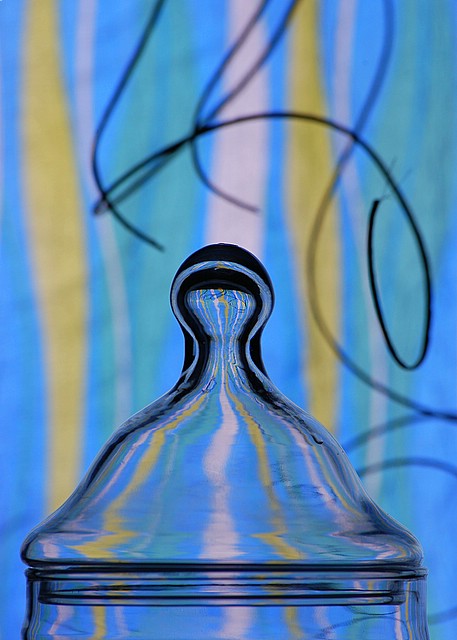
Didnt much care for this one. The colors arent really pleasant and the distorted lines in the backdrop arent enhanced in a good way in the refraction. The shadow lines curling around are pretty much just a distraction and the blackness in the tip is a bit too much. I didnt vote in this challenge but probably would have gone a 4. While the background is blurry it just doesnt do much for the shot. (Hope this isnt too harsh, just figured I would throw a critical comment in along with the other praises).
Well, I know you can do good stuff, so I'll be brief. It's all the cyan. Just kidding. It actually looks nice in this case. My biggest issue is the streamers. Why? What are they adding? Are we having a party? The glass piece also doesn't necessarily give the best refraction. I like portions (the bottleneck is neat), but I don't like other parts (the majority of black at the bulb and the blurred ring closer to the bottom). Bottom line is the whole picture doesn't give us any sense of purpose. Rikki's shots have a purpose of seeing some great refraction, but this one falls short on that count.
what in the world is that? great composition, and the out-of-focus parts are as interesting as the focused part. COOL!! Oh my gosh, and look at the reflection of the stripes on the glass too!







 Add photograph to your favorites
 Add photographer to your favorites

 Photographer found comment helpful.


