Using GIMP: Crop; brightness -20; contrast +20; lightness -20; saturation -75, scale, save as jpg.
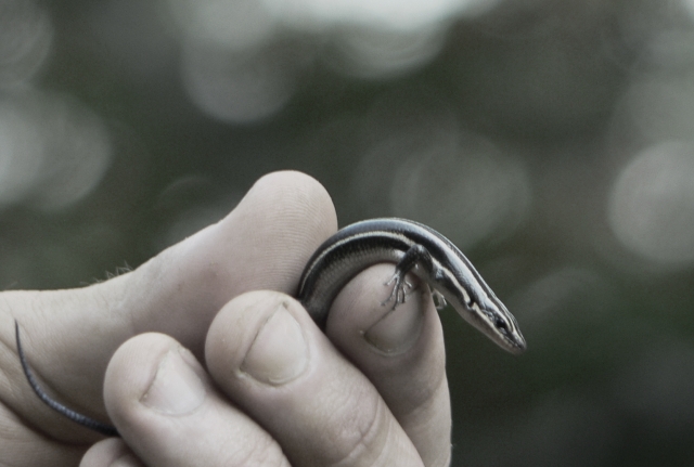
I desaturated because the very green background was distracting from the skink. I didn't make it grayscale because I liked the hint of color.
I'm asking for the critique because I'm getting a lot of positive comments, and those that state what they'd like to be different are sometimes conflicting. I don't understand why my rating is less than a 5. (hopefully that will improve by Tuesday).
Statistics
Place: 242 out of 432 Avg (all users): 5.1319 Avg (commenters): 6.3077 Avg (participants): 5.0746 Avg (non-participants): 5.1871 Views since voting: 925 Views during voting: 399 Votes: 273 Comments: 14 Favorites: 0
Since you asked for comments, I'll try to say something helpful. I have not read the comments that have already been made so I may repeat things that have already been said.
I think it is a nice shot of the skink. I get a good sense of what the creature is like and I can almost feel him squirming around between the fingers. I think it would have been much better if you could have shown more of the skink. It would have been great if he could have been on top of or in front of the two fingers in the foreground.
The out-of-focus background is nice--it is certainly not distracting from the animal. But I don't think the bokeh is adding much either.
I wish I could see the original. I have a feeling that the bokeh in green might add a sense of natural plant environment that would enhance the image. I'm also not fond of the partial desaturation. There is just enough color to make me start wondering about the color of the skink. I think I would prefer it in black and white. It is also possible that you could just turn down the green channel to take care of the excess and yet leave the hand and skink looking reasonably natural.







 Add photograph to your favorites
 Add photographer to your favorites

 Photographer found comment helpful.


