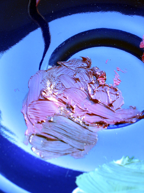
Very nice looking texture. The only thing I thing could be improved is the depth-of-field so that the paint in the foreground is in focus. *6* -balynch
Interesting. I like the colors. Wonder if a tighter crop would be more effective - like focusing right down to the brush strokes and the ridges of the paint - or a lower angle as well. Still a good photo and creative. Ruthann
This is a very interesting photo, and I love the texture in the paint(?). I must say however that I don't think the color shift improves it. Also, part of your subject is blown out.
Composition9 Originality9 Technical Aspects8 Meets Challenge9 Total Score9
For those that are just learning, like me.
Composition: Scoring in this area is based on basic composition of a picture and includes the rule of thirds, balance, cropping, and curved and diagonal lines. Subject matter that does not lend itself to the picture or otherwise unwanted is also considered here.
Originality: Scoring in this area is based on pictures or concepts that I have seen, as well as how much effort you have invested in the picture. Usually a little something that sets it aside from a snapshot. Does it make me want to come back for another look? You know things like that.
Technical Aspects: Focus, exposure, lighting, and other special effects (done by the camera), and post processing are all considered in this category.
Meets Challenge: This is based on my interpretation of if you, have/have not, met the challenge. This is fairly simple but quite important for this site.
There are many sites that can give you assistance in achieving better skills in photography, but I think the best way to learn is to take pictures and show them to other people. Believe me when it is a good one you will know it.
wow, love the colors of this. I think I would like it even better with a little more DOF to get the darker purple in the foreground in focus, too. still a great shot. 8 beegee
I just love the colors in this shot. The teture is great too. The lower part of the paint could stand to be in focus, but that's of little consequence. I suppose the way you have it helps give the image depth. good stuff.
Initially I didn't care too much for this shot, but after viewing it for awhile it has grown on me. I give it high ranking for creativity and artistic merit. I think the one think that puts me off a little is the lack of contrasting colors. I may also be the reflections draw away from the texture. This too might benifit from some additional unsharp mask.





 Add photograph to your favorites
 Add photographer to your favorites


