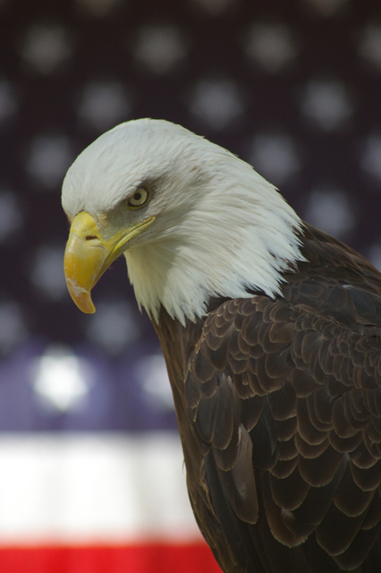
Nice take to the challenge however the image needs some post editing work, IMO. The two problems for me is the low contrast and the low saturation. To fix this in photoshop I would use a Curves adjustment (click "options" and then "enhance per channel contrast" and then ok). Then I would use unsharp mask to boost the local contrast (i.e. settings similar to this: Amount=16, Radius=25, Threshold=1). This would make the image pop more both in color and contrast. This still won't get the white on the eagle's head whiter like it should so maybe also use Replace Color, which is under "Images/Adjustments" menu and use the eyedropper tool on the eagles head and then bump up the "Lightness" slider a bit to make it brighter. If you choose the right spot you will miminize brightening the white in the background.
Anyway, just some suggestions on improving this particular shot. If you were to reshoot I would suggest getting much lower and shooting up a bit so that you only got the blue background with the stars. That way you would avoid the bright white stripe which is a bit of a distraction, IMO.
Would have given a 7-8 score for this if judged on the merits of the shot as it rates to the Bokeh theme. However, I will adjust my score to reflect what I think of your shot in relation to what we are trying to accomplish in Iraq and Afghanistan. You get a 10.
The lighting in this image made it so that the whites on the bottom corner of the flag are quite a bit brighter than the hood of the eagle. Alas, basic editing. I might have considered blowing the whites on the flag in order to get the exposure up on the eagle. He looks underexposed.
A little washed out. Try setting the levels with Photoshop (or equivalent). Maybe your monitor could be calibrated. Just use the gradient bar on the voting page to get set the contrast. Then we'll see what you do.
Have you used Curve to adjust the color/lighting a bit here? I think it would enhance the photo quality a whole lot. I love the background!!! This is truly Liberty. Good luck!
I really like this shot. However, I feel that the eagle needs to be much brighter and the overall image is severely lacking in contrast. Levels and Curves would have done this picture loads of justice...great idea though.





 Add photograph to your favorites
 Add photographer to your favorites


 Photographer found comment helpful.


