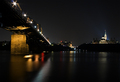
Yet another Santa Maria shot. This is taken on the Broad Street bridge in downtown Columbus at 9:50pm. I made it downtown about 15 minutes too late and missed a variety of colors inthe sky. I have never taken long exposures and wasn't sure what to expect. I liked how the starbursts formed over the streetlights. I tried a variety of shutter speeds and this one at 61 seconds came out the best I believe. I yanked my bokeh entry hoping that I may stand a better chance over here. Hope I didnt make a mistake.
Post Process - cropped, levels, adjusted hue and saturation on all colors, USM, NI, border, resize for web.
Statistics
Place: 47 out of 170 Avg (all users): 5.9432 Avg (commenters): 7.4000 Avg (participants): 5.8158 Avg (non-participants): 5.9743 Views since voting: 1712 Views during voting: 576 Votes: 387 Comments: 26 Favorites: 0
At first I saw this and was like "woah....awesome" but after a few seconds it lost some of the wow factor - the background houses seem pretty soft, and lights a tad washed out (so you lose the nice starbursts a bit). THe exposure seems perfect on the santa maria and the right hand side, but not so great in the b/g.
The colours, however, are lovely and rich, but I think there needs to be more of a focal point to the composition. The sky seems to lead you down to the middle of the buildings, but theres nothing there to see.
I loved the blues in this photo...and I think the color carries the whole picture. But I had problems with this photo. It seems to me that the focal point is hard to find...is it the boat on the right or the horizon buildings or the sky or the water. I can't tell and my eye is drifting all over this photo - admiring the blue but not able to rest anywhere. Also the buildings and their lights seem out of focus, which is important because my eye wants to rest there...if only because the soft lines in the sky lead down to the buildings and the shoreline on both sides of the picture do the same thing. Perspective seems to draw me to the buildings and their lights, and I am disappointed that they are not crisp. I recognize that I am in the minority in this instance because I voted a 5, even though I wanted to go much higher because of the blues.
I've not yet even had the chance to look through the entries for this challenge - I'm surprised, though, that this is below a 6. It looks almost "Rikki'd" by the way. The blue is awesome, particularly the water - very rich. I recognize your boat over there on the right. The only minor distraction for me is the building (?) in front of your boat - the greenish color sort of stands out. I do, however, realize there isn't anything you can do about that in basic. As for balance, I'd maybe pull the horizon just a wee bit lower... Nope. Just tried it and I like it better your way.
Trading post...
I didn't vote in this challenge but did glance through and knew this was yours. Excellent job. I love the starburst lights. The water is very calm and the deep blues are peaceful. The boat caught my eye in the thumbnail (which is how I knew it was yours). It has a really nice reflective quality to it.
great blue!! i love how the clouds match in the center. very calm atmosphere. the ship on the right looks interesting. is there a crew's nest on top?
yarr!!






 Add photograph to your favorites
 Add photographer to your favorites

 Photographer found comment helpful.


