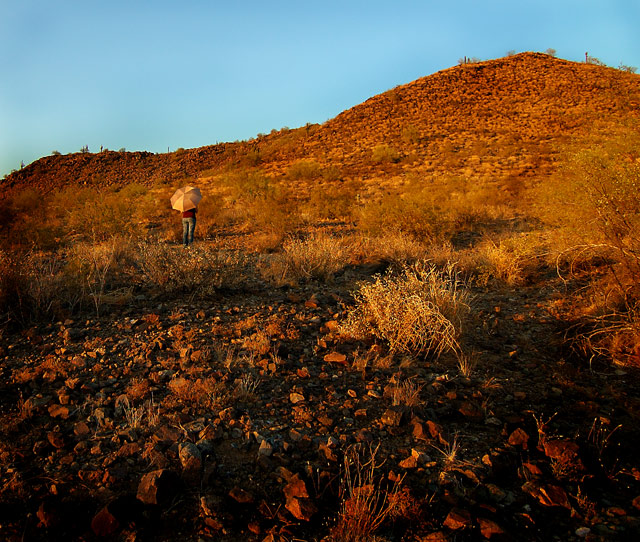
umbrellas typically do well in challenges ... I should know :] ... anyway, in this case I think the new-looking umbrella erases much of the desolate feeling here. The scene is excellent and having a person there is fine ... maybe an umbrella that's been beat up would work better here. 6
I really dig the composition, I think the umbrella is terrific; great texture in the red; the only distraction is the digital blue sky. but you can't help that; nice job.
This is a good idea, and a great location. Technically is pretty good. I think the person doesn't stand out very strongly, especially with the color of the umbrella, kind of blends in with the surrounding area, in fact, I almost missed it. Perhaps placing the subject somewhere else in the composition could be stronger? Possibilities I see- lower in the frame, where the dark rocks are, the lighter colored umbrella would contrast with the darker area more. Or up towards the upper right thirds intersection, where there is no brush, and a little redder. Or somewhere along the actual ridge, where they would stand out against the sky. Although the person is placed on the left thirds line, any of these other possibilities would also place them stronger on a thirds intersection. A cool concept, fits the challenge, but I feel if the person were more prominent, it could boost the score some.





 Add photograph to your favorites
 Add photographer to your favorites


 Photographer found comment helpful.


