I have to admit this is not one of your best. It suffers from a "boring" point of view and flat colours/lighting, making it seem very snapshotty.
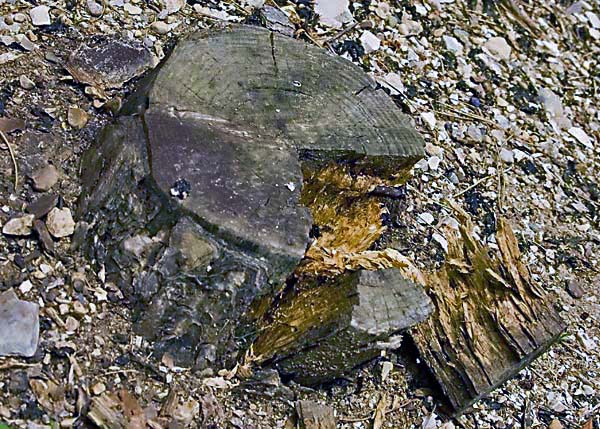
You definitely need to get a more interesting angle, to make the stump stand out from the b/g better, but even so, I don't really get a particular sense of desolation from this. I agree with the commenter that said it looks like you just came across it, pointed the camera down and took a shot - this feeling should definitely be avoided
Background is too busy, competes with the subject of the photo. Since the colors are the same, there is little to distinguish the stump. Overall, this one lacks punch IMHO.
Trading POst - Not sure what to tell you on this one. Very flat shot with an odd angle. Not pleasing to look at, even from a point of view of looking at dreary type shots. The subject itself doesnt really hold much interest and the presentation doesnt help.
Trading post...
Dead or rotted wood (or even roots for that matter) will never do well here. It will always seep right into the background. Maybe if you had somehow made the stump stand out somehow it could have gone up a small percentage, but I think that's the most you could have gotten out of it. Sorry :) but it not your best work. BTW - I gave you a 4 in voting on this.
I remember commenting on this one during the challenge. You may want to try burning the background to darken it, make it recede a bit. This shot might also be more interesting taken from a lower level, maybe a bit closer to the splintered wood to get more of that texture. As shot, you do tend to lose the separation of the subject from the busy and similarly colored background.
The lack of any shadow anywhere makes this very flat and two-dimensional. I know little about lighting effects but maybe others can offer some suggestions for bringing out the best in a subject like this :)
This photo could be much more interesting if you took it from a lower angle, and/or if the subkect wasn't centered. It could also use a bit more contrast. The log is sort of going up in the background.
An interesting subject, that seems to have good potential. I'm feeling that this isn't the strongest presentation in this shot though. The point of view isn't very stimulating, it appears as if you came across this stump, and pointed the camera down and took a shot. Perhaps getting down low, or finding a dramatic angle, something other than a typical view you would see could be better. I think you may have also fallen into a territory where the shot is wanting either more or less. Less meaning, get closer in, show the viewer just the wood and broken pieces, really key in on the subject. Or more being, if the shot is going to include some of the surrounding scene, show enough to add context, enough to use some space to position the stump in the frame on a thirds line, or out of center, try to give some dynamics to the composition, things along that line. I'm also thinking that a little tweaking in editing could make for an improvement also. Maybe a little levels or curves adj, strengthen the tonal range, and some usm to get a little sharpness.







 Add photograph to your favorites
 Add photographer to your favorites


 Photographer found comment helpful.


