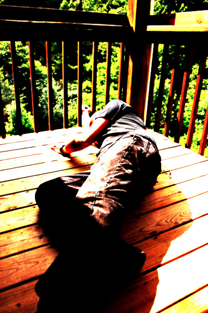
My artistic attempt at showing, illustrating, or personalizing "what desolation means to me." Desolate. Left out. Unhappy. Unwanted.
The black has purpose here, even though this turned out NOTHING like my "vision".
PSD file is available. Editing steps really unknown, except for the fact that no selections were made. There is a high pass filter, some alternate blending modes, and a USM for contrast. Some adjustment also done in Canon DPP prior to RAW conversion.
Not intended at all to be a "pretty" image. Fully expected to crash and burn and lower my average to an all time low.
Hope you enjoy :)
File name
CRW_6186.CRW
Camera Model Name
Canon EOS DIGITAL REBEL
Shooting Date/Time
6/18/2006 16:36:06
Tv(Shutter Speed)
1/400Sec.
Av(Aperture Value)
F4.5
Metering Modes
Evaluative metering
Exposure Compensation
0
ISO Speed
100
Lens
18-55mm
Focal Length
18.0 mm
Image size
3072 x 2048
Image Quality
RAW
Flash
Off
White Balance
Auto
AF mode
AI focus AF
Picture Style
-
Parameters
Tone Curve : -
Sharpness level : -
Pattern Sharpness : -
Contrast : 1
Sharpness : 1
Color saturation : 1
Color tone : 0
Color matrix
-
Color Space
sRGB
File Size
6024 KB
Drive Mode
Shooting with self-timer
Owner's Name
Bernard Shuford
Camera Body No.
0560150116
Statistics
Place: 188 out of 197 Avg (all users): 4.4262 Avg (commenters): 4.4545 Avg (participants): 4.3253 Avg (non-participants): 4.5100 Views since voting: 882 Views during voting: 303 Votes: 183 Comments: 17 Favorites: 0
I'm not sure what I think about this one. I think that if I can across it in the challenge I wouldn't have voted it terribly well, but looking at it now I'm beginning to like it a lot more.
The high contrast does play a role I believe, even if it put me off to start with - not sure how to describe it but it does gice a kind of lost, desolate, not-sure-whats-going-on-with-your-life feel to it, which I think is what you were aiming for
I still think the processing went a bit too far though, but it certainly made me think
i was unable to enjoy the processing of this one. the concept seemed good enough which kept you from getting a lower score from me... but i did not like the processing at all. i could not understand the point of it, how it pertained to this particular shot.
This one is too processed for my taste especially the leaves in the background. I am not sure I get the point of the shot...looks like he is just hanging out on the deck, so I am afraid I don't see the "desolation". The black area lacks definition so I can't tell what it is. The culmination of all of this is that I really can't quite figure this one out, I am sorry to say. I didn't vote in this challenge, because I was out of town. It's probably just as well as I wouldn't have helped your score any given my inability to figure it out and the extent of the PP. lol.
Trading Post - I must say that I didnt get this one during challenge and I still struggle a bit now. I could tell that you were shooting for something but wasnt quite sure what. The processing was over the top and made it a bit hard to look at. So what is the purpose of the black?
Trading post...
I gave you a 5 in voting on this. It seems to suffer from over processing. I think if you had taken this a little later in the day, more towards twilight it would have gone over better. Don't get me wrong, I'm not against the overprocessing (as you've seen and will see again with my glass challenge), hence the 5, but sometimes it just doesn't seem to fit with the voters.
First, I've gotta say I love reading your comments on your photographs. I commented on this during the challenge - like the idea and the composition but am not thrilled with the processing. That said, without the processing I suspect it wouldn't have been as interesting a picture, because it is interesting - makes you stop and look. I think you came pretty close to achieving what you set out to do, and that's a good thing!
While it is possible that the image could be interpreted as conveying a sense of "Desolation"... it could also be representative of the results of a Friday Night "Binge".
The harshness of the lighting would seem to suggest that the image was taken at High Noon, and the dark shadows at the bottom portion of the image effectively obliterate any definition that may have existed.
Keep shooting... practice it is said ... makes perfect.
I can't decide if I like the grunge or not... but it's certainly noticable, which is why I'm mentioning it :-) The black shadow is a little distracting for me, but I think it's a great pose and camera angle. The bars might even give a feeling of imprisonment if the tops of the railing were not in the scene.






 Add photograph to your favorites
 Add photographer to your favorites

 Photographer found comment helpful.


