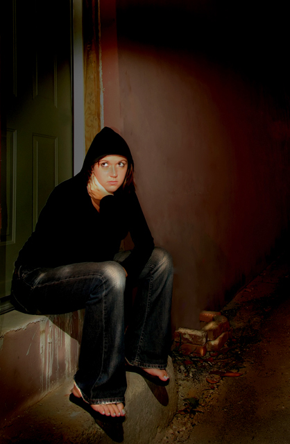
Ok, this is the immediate shot that came to mind when i saw this challenge. it was a challenge for me, for i usually do happy portraits, but i had a lot of fun w/ this. totally different style for me.
post processing: *i used my 18-55 wide angle at 18mm on this one, so some of the lines were bent, so i ran it through PTlens set to my lens and it fixed it right up. cropped the dead pixels from that out, and they were straight.
**levels adjustment layer to darken entire photo. i flashed her with my speedlight at the last split second of the exposure to get more detail, so it was pretty bright.
***curves adjustment on the RGB master channel.
****dodged a lot of the creases in her jeans and some of the cracks for detail. also burned her eyebrows, the corners of the picture to bring the viewer\'s eye in to her, and cloned out a small twig that was coming up from the bricks in the background (her right).
*****Noise Ninja ran once, VERY slight unsharpen mask, and save for web.
have no clue how this will score. i just hope i keep above a 6, which is my goal from now on. hope you enjoy.
-Jed
Statistics
Place: 114 out of 197 Avg (all users): 5.4278 Avg (commenters): 6.4444 Avg (participants): 5.3333 Avg (non-participants): 5.5049 Views since voting: 1000 Views during voting: 310 Votes: 187 Comments: 13 Favorites: 0
First of all I would like to say that you have a very beautiful model and I would love to have the opportunity to shoot her. This shot begs for my what I like what I don't like treatment so here goes...
What I like: Compositionally, this shot is right on. You have your model in one third of the frame. This doesn't exactly follow the rule of thirds but is very close and works well. I love how you have your model posed and her expression. I love how it appears that your lighting surrounds or floods the area that the model is in, however...
What I don't like: This to me looks a tad bit overprocessed. Please remember that this is only my opinion and I'm a bit old school when it comes to post processing. The circle of light around your model almost looks to perfect as if it was created in the p/p. The fade off from lit to shadow is too dramatic. It doesn't look real. Your model also looks a little plastic. This is probably a result of the neat image. I don't know exactly why, it may be a combination of the lighting and the use of neat image, but her clothes don't look 'real'. There is a bit of fuzziness to them that makes it look surreal. For this critiquer, this doesn't work all that well. The last thing I would have to say I was drawn to in a negative way is her eyes. They look dull or dead. Even the slightest bit of catch light in her eyes would have added a lot of feeling to the shot.
Overall, it's a nice shot. With a little less in the post processing and a touch of catch light this could be a great shot.
Hmmm, you know, I don't see any obvious problems with the shot. One thing that gets me a bit (but isn't a huge deal) is either her pose or the shadows or something makes her upper body look very triangular. In other words, her head looks disproportionately small. Maybe it's the hood holding her hair down and we are used to seeing the extra space hair takes up. That isn't enough to get you down to a 5.4 though. One other thought is that she looks perhaps a bit too clean to be truly forlorn. Is life really that bad with your manicured toes in your flip flops and designer jeans made to look ragged?
I bet your biggest issue here was the emotional definition of desolation. Yes, I 100% agree it fits, but people are so literal on this site it probably lost some for that. Note the 29 4s. There is no way a photo of this quality gets a 4 other than people don't think it fits the challenge well.
I think the composition, focus and lighting are all well done. Just chalk this one up to the voters not "getting it" because they take an average of 3-5 seconds to vote each picture.






 Add photograph to your favorites
 Add photographer to your favorites

 Photographer found comment helpful.


