thank you all for the kind comments and votes. i really liked my photo this week but never expected it to do this well. for those who wanted to see the color version, you can check it out under the texture challenge at the link below. i suspect you will like the b&w version better ...
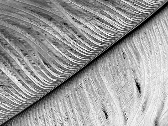
this is excellent representation of texture... I like the diagonal as well... This diagonal is almost too perfect... I would like it better if the diagonal didn't hit the corners so perfectly... good shot :) = 9 - jmsetzler
Wonderful composition and texture. Especially enjoy how the light reflects differently between the upper and lower areas. Excellent focus and the choice of black and white really works well for me also. Great! LanSnake 10
Very detailed subject, technically excellent, well composed with the use of the diagonal and great variety of texture and contrast, beautiful black and white....10..hokie
Composition8 Originality9 Technical Aspects8 Meets Challenge10 Total Score9
For those that are just learning, like me.
Composition: Scoring in this area is based on basic composition of a picture and includes the rule of thirds, balance, cropping, and curved and diagonal lines. Subject matter that does not lend itself to the picture or otherwise unwanted is also considered here.
Originality: Scoring in this area is based on pictures or concepts that I have seen, as well as how much effort you have invested in the picture. Usually a little something that sets it aside from a snapshot. Does it make me want to come back for another look? You know things like that.
Technical Aspects: Focus, exposure, lighting, and other special effects (done by the camera), and post processing are all considered in this category.
Meets Challenge: This is based on my interpretation of if you, have/have not, met the challenge. This is fairly simple but quite important for this site.
There are many sites that can give you assistance in achieving better skills in photography, but I think the best way to learn is to take pictures and show them to other people. Believe me when it is a good one you will know it.
The intriguing thing about this shot is the corner-to-corner hard line separating the soft feathers. Unfortunately, the shadows in the upper left are vague and do not contribute to depth, though the harsh centre shadow does this quite well. I'm not fond of the lighting in this shot and it also flattens the image somewhat. Moving the shadow line so it does not equally divide the shot would have added some depth I think and allow more feather to be featured.
I find this a nice view of a common subject. The extremely tight crop works well and the detail is very good. I also think tha the lighting is spot on. Good job.







 Add photograph to your favorites
 Add photographer to your favorites


 Photographer found comment helpful.


