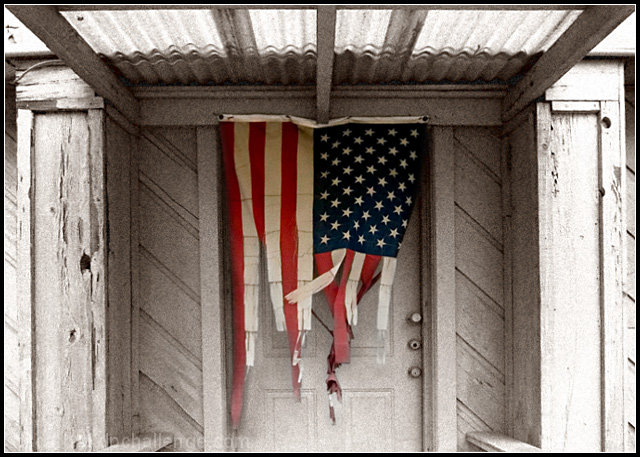
Tattered flag hanging in from of an old building. No political statement here, just thought this looked very intresting for this challenge.
RAW - Increase shadows in the RAW converter
Lens correction filter
Pen tool to mask flag
Make path from Path created with pen tool
feather selection
copy flag to new layer
desat background layer
reduce size for DPC
add Film Grain filter to background layer
adjust color on backgrond layer to increase reds and yellows for duotone effect on background
flatten image
save for web
Statistics
Place: 106 out of 197 Avg (all users): 5.5109 Avg (commenters): 7.3636 Avg (participants): 5.3205 Avg (non-participants): 5.6509 Views since voting: 1049 Views during voting: 275 Votes: 184 Comments: 14 Favorites: 0
ya, another entrant learns the risk taken in entering the American flag. I'm sure at least a few of the 1-3 scores were purely for that reason.
That being said, you took a number of other risks as well. Film grain. Centered composition. Selective desat. Abstract interpretation of the challenge. Basically this shot was a DPC minefield. And you STILL scored a 5.51. So I'd take the 5.5 as a man who walks away after being thrown 50 feet after crashing his motorcycle...
First impression of the shot is one to look a bit longer at the image, to find out what is going on. This is a good thing, you have captured the interest of the viewer. The lines of the roof draws the eye in to the flag, and the diagonal boarding behind it frames the vertical lines well.
I like the central composition. This is a good example that not every image needs to conform to the rule of thirds. Personally I think I would have cropped a bit more off the corrugated roof, maybe until the point where the roof meets the side walls, and shown a bit more of the railing at the bottom.
I like the post processing. The selective color treatment works well, and the grain gives it a more desolate feeling. Without it it wouldn't meet the challenge as well.
The bright spot at the bottom bothers me a bit, as do a few other places where the highlights are a bit blown. The bottom flare takes the attention away from the flag. Not sure what you could have done about it though.
The image meets the challenge in my opinion, but not as strongly as many other photographs in the challenge. I'm sure that cost you a few points.
Personally I would score this picture higher than the score you received, and I think the flag subject just isn't that popular.
very good job on this one, it is well framed with great thought going into this making the flag colored and the home white, it makes the flag demand attnetion to the tattered old ragged nature.
Flags usually repel me as much as photos of cameras do. But in this case, you have captured something quote delapidated and in doing so managed to portray desolation quite well. I only wish it had been tilt corrected and perhaps processed a little. Well done.
this is an interesting concept but too much noise. and the flag looks like it was cut in strips. It looks natural at the bottom then becomes slightly contrived. maybe that was all natural but it doesnt look that way. 5




 Add photograph to your favorites
 Add photographer to your favorites

 Photographer found comment helpful.


