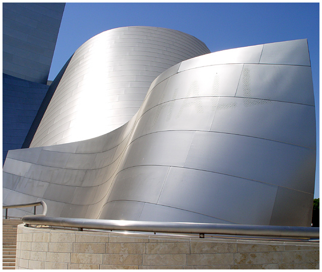
This is the brand new Walt Disney Concert Hall in downtown Los Angeles and is the new home of the LA Philharmonic. I forget what the outside is made of but it reflects light quite nicely. :)
Statistics
Place: 23 out of 96 Avg (all users): 6.1311 Avg (commenters): 6.7000 Avg (participants): 5.9667 Avg (non-participants): 6.2903 Views since voting: 1795 Votes: 122 Comments: 14 Favorites: 0
fyi, the panels are made of titanium. i would say that is one of mr. gehry's favorite materials to use on his buildings.
back to the phot, it's a great shot, i would have brought the viewing angle up a bit higher so that the railing would show some movement to echo the building. At the current viewing angle the railing starts to come off the page, but then turns into a hrozontal element. if it came out of the page it would be much more dramatic and really reinforce the movement going on in the photo.
you should try photographing this on a gloomy/ rainy day. the titanium takes on many moods due to weather. it's always an interesting subject.
I know this is late but I'd like to thank everyone for their comments about this image. I took a break from DPC just because I thought this picture was doing so well and then no ribbon. I was devastated to say the least. Anyway, I came back and cast some votes in the shapes challenge because I figured I'd better vote before I submit to a challenge, right? :)
Anywho, I'd like to say thanks, again, for all the useful and constructive comments and so sorry that it took me so long to reply to everyone.
Well chosen subject and nicely taken shot. A striking form indeed. I would perhaps have allowed either more space to the right or cropped out the background altogether, which would redirect focus even more onto the shapes created.
Beautiful curved lines makes the composition very interesting. Without including the lines of the rail on the stairs yours eyes look right at the metallic shape that says "Walt Disney Concert Hall". On the rightside either include more of the sky or keep it out of the composition. Cropping in closer will do the trick. On the leftside of the photograph. The side in rather interesting with the straight lines. It's a bit dark compared to the main part of the picture. I think putting more of it in the background would bring out the center curves out even more.
Would like to see this cropped quite a bit focusing on the two main silver/curved sections. I find the stairs/stones and shadow parts distracting from those gorgeous simple lines and tones.
Excellent perspective shot on a magnificent contemporary space! The visible background (trees, bottom right) is the only enigma, although I can appreciate the current crop. In the end and with respect for the challenge rules, I'd rather have the pleasure of seeing it at all!
This is just a very cool building. I think you cropped a bit tight. The blue buildings on the left really add to the geometric feel and go well with the blue sky.. could've shown a bit more of them. 8






 Add photograph to your favorites
 Add photographer to your favorites

 Photographer found comment helpful.


