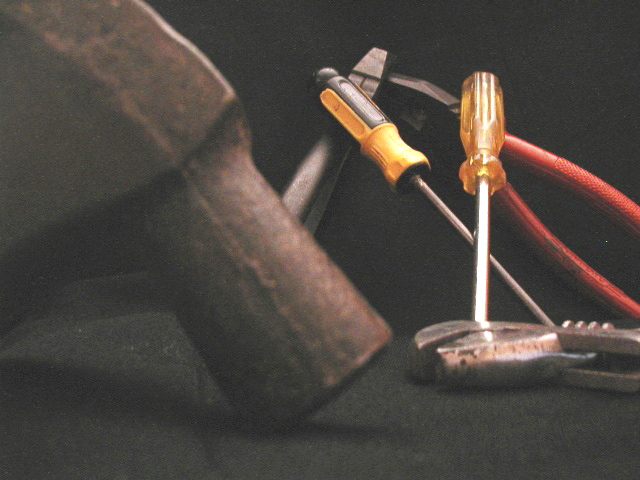
The concept of having a set of tools in miscellaneous positions is a good one. I like that. However IMHO implementaion could have been better. You can put my thoughts in the "for whatever it is worth" department; I mean no disrespect.
Number one, this needs more brightness and contrast. That would make the tools stand out out better and the background jet black. Two, for me it does not work that the foreground object is so large and close yet it is out of focus. It begs to be the main subject, but it is not. A different arrangement would be better. Lastly, with a dark background it is important that colors stand out. Yellow and red are both fantastic colors for a black background. In this image the color should be adjusted more to bring that out.






 Add photograph to your favorites
 Add photographer to your favorites


