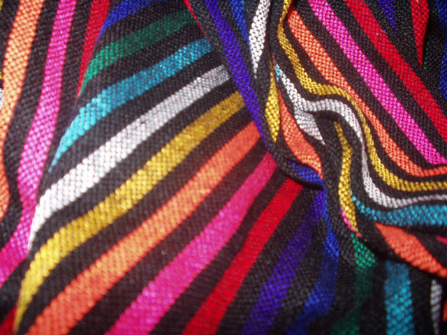
Great colors and texture. If more than 20 percent of this shot was in focus, you'd have a good chance of a winner. (attempting a lighter, funner way of saying you need a wider depth of field, while stating the idea was GREAT!) 6 Swash
This photo does show texture. However, the focus is blurry, and it is pretty much a wallpaper shot - fills the entire field with the item. A picture of fabric doesn't capture my interest. It is colorful, but I don't think that this much color over the entire field works for me. I'm also looking for a bit more creativity.
this photo would look so much nicer to me if the main swatch of fabric on the left were in focus, and not the one on the left. the colors are vibrant and the texture is appealing. ~mcmurma Aesthetics...5 Meets Challenge...7 Overall...6
Composition9 Originality8 Technical Aspects6 Meets Challenge8 Total Score8
For those that are just learning, like me.
Composition: Scoring in this area is based on basic composition of a picture and includes the rule of thirds, balance, cropping, and curved and diagonal lines. Subject matter that does not lend itself to the picture or otherwise unwanted is also considered here.
Originality: Scoring in this area is based on pictures or concepts that I have seen, as well as how much effort you have invested in the picture. Usually a little something that sets it aside from a snapshot. Does it make me want to come back for another look? You know things like that.
Technical Aspects: Focus, exposure, lighting, and other special effects (done by the camera), and post processing are all considered in this category.
Meets Challenge: This is based on my interpretation of if you, have/have not, met the challenge. This is fairly simple but quite important for this site.
There are many sites that can give you assistance in achieving better skills in photography, but I think the best way to learn is to take pictures and show them to other people. Believe me when it is a good one you will know it.
Nice colors. The blur in the front forces your eye to the upper right (as do the colors and lines) where it is more focused. If it were turned upside down, the blur would be at the top, and I think it would feel a little more natural. karmat
Very colorfull, I like the striking contrasts between color and black. The area of the image, lower left, where my gaze is being drawn should IMO be the area in sharp focus.







 Add photograph to your favorites
 Add photographer to your favorites


