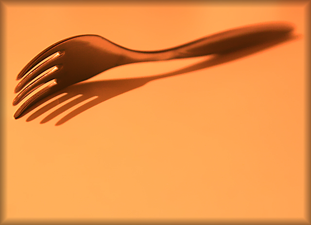
composition is a little unusual in this one, as is the choice of tones... not sure such warm orange / peach colours really works on something tha would normally be cold to touch. the shallow depth of field adds interest, though i would have preferred the blurriness to start just behing the curve spine bit in the fork. i don't normally refer the border, but here it's so prominent (and distracting) i thought i should; something simpler, in a more complementary shade would probably work nicer. it does meet the challenge, but overall it just lacks a certain pazzazz. 6.
Challenge: SHADOWS III
Description: Creatively capture a shadow Advanced Edit
Simplicity
Fit: Epitomises the idea behind the challenge 2
This is a great use of a shadow in a simple way
Aesthetics: Well composed, aesthetically pleasing 2
Technical: Technically well executed 2
Hints of some noise let this down a little
Wow: Slaps you in face 3
This one did it for me
Total Score = 9
Nice, but I think I would have preferred it if both the tip and stem were in focus too. Or maybe the tip is unsharp because if the blurred border. It distracts a bit either way.






 Add photograph to your favorites
 Add photographer to your favorites


 Photographer found comment helpful.


