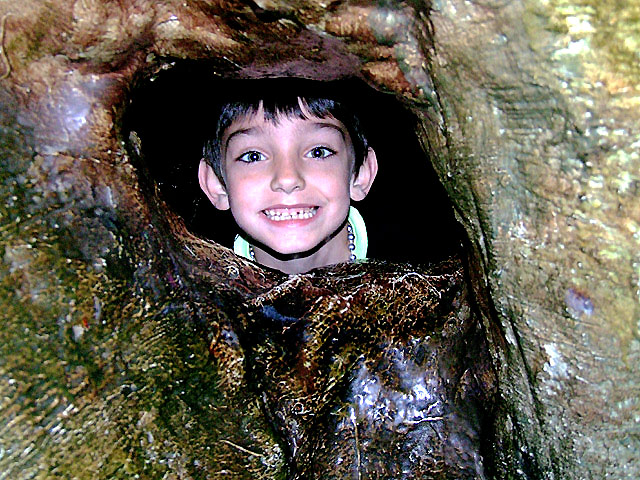
I love the composition here and his expression, but the lighting is very harsh. I'd also prefer a little more DOF so that the texture on the treehouse was in focus throughout.
Another suggestion might be to have had his hands visible on the ledge, to give a more "trapped" feel rather than "peeking through"
I like the framing and the expression on the boy's face. I might have cropped this a bit closer to emphasize the boy rather than the frame...but either way it works for me.
The lighting seems harsh...like the flash was working overtime. The effect is to put light a bit unnaturally on his face.
I was out of town and couldn't vote. But had I been able, this would have been a 5, perhaps 6, for me. I think it is better than the scores indicate (a score of 1,2,or 3 seems pretty harsh, IMHO)
Trading Post - I scored this a 5. Met the challenge for sure and his expression is funny. The colors seem a bit unnatural on his face and the it seems to be oversharpened as a whole. Maybe it was just the lighting. Caught some cool textures in the rocks but oberall not enough interest to garner a higher score.
i think you probably already know, but.... the flash is simply too harsh. i have just read a photoshop book that talks about how to post process this. though.... i cannot remember the steps...lol. sorry, i am just a fountain of knowledge huh?
Heh! LOVE that expression! Definitely meets the challenge. I didn't vote in this one but would have given it a 6. What probably hurt the score (I haven't read other comments yet) is that the lighting seems rather harsh on the framing element; it's a bit overpowering, even though the subject is well-lit. Maybe a tighter crop would help, but I kinda like it the way it is as far as composition.
well framed, could use a tighter crop from the left to get the kid off center.
the lighting is really harsh, knowing it's from spotlights you could have brought a white umbrella to put beween the spotlight and the kid to soften the light.
I think it's over contrasted, with some burned out spots both in his face and the tree.
with a softer light, tighter crop and better postprocessing you could have scored 100 places higher.
Ooh, definitely well framed. Maybe a hair too wide on the framing, and the flash was definitely not being friendly. I think a tighter crop would have been stronger.
Actually there was no flash used on this picture. They have very bright spotlights there that shine on the tree. It's supposed to look petrified.
Ooh, definitely well framed. Maybe a hair too wide on the framing, and the flash was definitely not being friendly. I think a tighter crop would have been stronger.
3 - Could be good potential here. Overall (framing 'enhancement' aside), seems a bit 'snapshottish'. Further back and better focus on the tree(?)/frame and a ... different 'pose'/face on the 'model', make this better in my opinion.
Nice picture well composed, but needs to be a bit sharper or more clear. It's possible that unsharp mask or similar has created a kind of artefacting around the edges, especially the boy's face. Great composition and lovely picture otherwise.





 Add photograph to your favorites
 Add photographer to your favorites

 Photographer found comment helpful.


