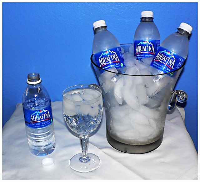
I am always teasing my wife about the fact that we spend money on bottled water, when we have perfectly good water available from the tap - for free! If you price it out, it really is more expensive than gasoline (per gallon of each), although gas is catching up.
I shot this in my home "studio" which in this case means my guest bathroom. I had been planning to shoot in my kitchen "studio" but realized on the day of the shoot that I had a really nice blue wall in the bathroom that would work well with the blue labels on the water bottles. It was very cramped and hot in the bathroom, but I am pretty happy with how this turned out. I don't have any real lighting kit, so I just had to settle for the integrated flash on my camera. I used a tripod and two-second timer to take the shots from maybe 30 inches away from the subject.
Post processing with Gimp was crop, levels (first time using levels - very cool tool), curves, color balance, re-size, and USM.
Statistics
Place: 63 out of 109 Avg (all users): 5.1851 Avg (commenters): 5.8421 Avg (participants): 5.1167 Avg (non-participants): 5.2016 Views since voting: 975 Views during voting: 410 Votes: 308 Comments: 21 Favorites: 0
Thank you all for the kind comments. I must say I am very disappointed in my score and showing in this challenge. I knew this picture wasn't an overall "8", but I really thought I could average a "6" and top my previous best efforts. I thought my idea for the challenge was original, with a little humor, thus making it at least a 5 for concept. I thought the execution was pretty good. Composition was okay, colors, crispness, etc... pretty darn good. While I certainly understand not voting this a really high score, I am stunned that 38 voters felt this was worth a 1, 2, or 3. I am a somewhat stingy voter myself (few 7, 8, 9)and I only give 1, 2, or 3 to really bad photos or to photos that make no discernible attempt to meet the challenge.
What makes it more disappointing is that with the small number of entries, and the overall quality of the entries (not a strong group), I really felt I had a chance at a better finish.
Oh well, I am still proud of the shot. It was an elaborate set up (for me) and I did a lot better job at post-processing than in previous efforts. Back to the studio!
I think this fits the challenge well. I like the blue background because of the way it matches up with the bottle labels. I don't care for the diagonal crease in the cloth or the tilt effect of the bottle (I realize you can't do anything about it in a basic challenge). 6






 Add photograph to your favorites
 Add photographer to your favorites


 Photographer found comment helpful.


