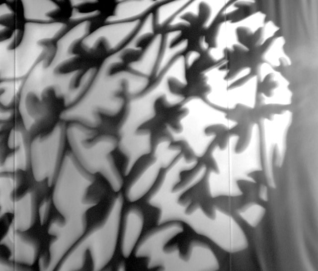
Not really! But I thought that's what it looked like. It's the screen (almost like a sheet) between 2 sets of open doors to block out the light from the new Big Cat Falls Theatre at the Philadelphia Zoo. The shadow is a fake tree right outside and though it is actually a shadow, it shows up kind of green due to the color in the projector going to the screens on the wall.
Cropped, converted to b&w, sharpened, resized for web.
Statistics
Place: 136 out of 154 Avg (all users): 4.7472 Avg (commenters): 3.7500 Avg (participants): 4.7353 Avg (non-participants): 4.7545 Views since voting: 971 Views during voting: 252 Votes: 178 Comments: 11 Favorites: 0
I think you've shown some "photographers eye" in spotting this opportunity, but not fulfilled its potential. I didn't vote in this challenge but would probably voted a 4 - there's not enough going on to keep my interest, especially with the softness. Also, I'm not a fan of the uneven lighting.
One suggestion for editing (I can't try right now as I don't have PS on this computer) would be to boost the contrast and add some colour to accentuate the pattern you found - not sure if this would work well, just a thought.
I am afraid this is going to sound like a broken record, but I also think that the focus is off and the shadows are not crisp. I didn't vote in this challenge because I was out of town, but I probably would have been in the 4 - 5 range. I almost think this might have been better if the crop was not so close...to give more perspective at what I was looking at (beyond a shadow)...is it a window? ...a wood carving? I can't tell. (o.k. I just saw the title. Now I know what I am looking at. All the same the picture didn't really clue me in.)
sorry but i am on that hit this one hard... seemed like the shadows were out of focus. i know that shadows are never really in focus per se, but this one seemed like it was even more so than necessary.
i also thought it was a bit on the busy side and did not have any true focal point. looked like a throw in to me.
on a positive note. it at least was a shadow. lol. just messing of course you typically do well this is not your best work.
Trading Post - Well I will admit that I gave this a 3. Looking back on it now I must have been in a rare mood as it does fit the challenge in that you took a picture of a shadow. I shouldnt have been so harsh. But that being said, I just didnt find this interesting at all. THe shadows were not crisp and the lines on the canvas didnt help much. The b&w tones didnt seem to be flattering either. You can and have done better.
if the shadows were sharp and crisp this could have scored high, but with everything moved in the image you can't help it so there is no use coming up with helpful critique,
When voting, I thought this very much looked like a metal tree of some kind but I wasn't sure about the fence part. It does form a nice abstract. I think it would be kinda cool to see it in color - shadows don't have to be gray. I think the fact it's a little fuzzy and ghosted in places may have affected the score, and I suspect part of that fuzziness is the slow shutter speed, though it does kinda create a neat effect - almost haunted looking.






 Add photograph to your favorites
 Add photographer to your favorites

 Photographer found comment helpful.


