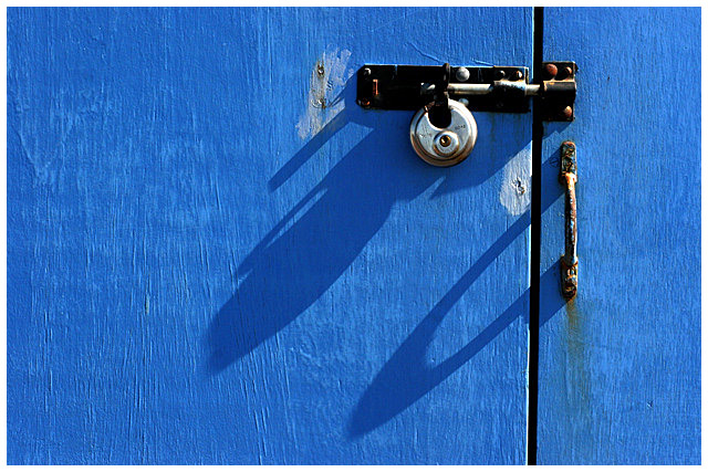
I do not think this will score well, hardly a creative capture of a shadow. I liked the blue color of the shed and the shadow of the old padlock that the early morning sun was casting...
Statistics
Place: 45 out of 154 Avg (all users): 5.9171 Avg (commenters): 6.9286 Avg (participants): 5.8028 Avg (non-participants): 5.9909 Views since voting: 990 Views during voting: 264 Votes: 181 Comments: 15 Favorites: 1 (view)
First Impression:
Nice blue! My eye is drawn to the lock, the bolt, the black vertical line, then the shadows
Composition:
I like the fact that the lock and bolt are not centered. The lighting really works well with the blue and the paint texture.
Subject:
Meets challenge, but the shadow was not the main point of interest.
Technical:
Despite what others said, I find it a bit grainy. Given the light I’m surprised you used ISO800. You didn’t include any post processing comments so I’m not sure what you did, if anything.
Summary:
The blue and composition really carried the shot. Congratulations on your 71% placement. Supports your goal!
Challenge: SHADOWS III
Description: Creatively capture a shadow Advanced Edit
Sahdows, color and texture
Fit: Clearly meets the challenge 1
Aesthetics: Well composed, aesthetically pleasing 2
Simple but effective with the blue of the wood really acting as a great backdrop
Technical: Technically OK 1
This is let down by a lack of detail in the latch, padlock, hasp and handle where the shadows are too dense
Wow: Real impact 2
As an image this one caught my attention straight away
Total Score = 6
Too much focus is set on the lock and not the shadow. I do like how you caught the photo of the lock off center. Most people would put it squarely in the middle.
I like the color a lot. I'm not too sure if the rest is quite gelling for me as a creative visual statement. I think I would like this better [iwithouti] the shadows actually. The shadow create more distraction then asthetic appeal for me.






 Add photograph to your favorites
 Add photographer to your favorites

 Photographer found comment helpful.


