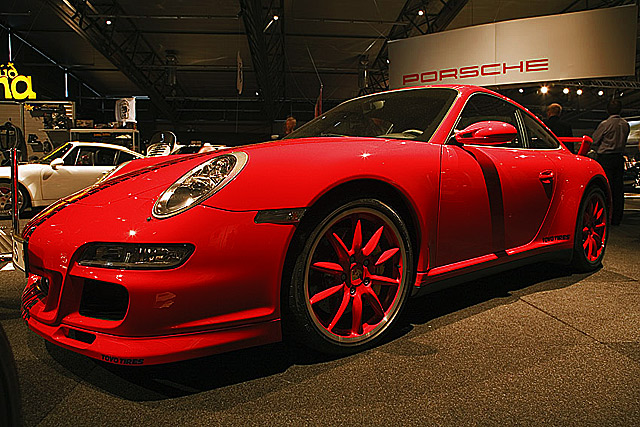
This is a very clean, professional looking shot, and fits the challenge fine. I like the alignment of th word Porsche in the b/g, and the wide angle used. What bugs me, however, is the red on the wheels - I'm assuming they're only that colour from reflections..?
It does seem a touch oversharpened, as others have pointed out.
I think its a very good photo, say, for a magazine (though maybe with a slightly less busy b/g), but I can't imagine it doing much higer than a 5.5 here, just because it doesn't have so much life to it
The car is fabulous! The background however does it no justice and draws my eye away from the car. It does seem like the car has been over-sharpened a bit as I am getting a halo effect on my monitor. Everything about this car is low curves and horizontal flow - except the shadow of the mirror, which tends to cut the car in two pieces. I realize that you couldn't do anything about the lighting, but it's a shame nonetheless.
Trading Post - The car itself looks pretty cool. I like the starbursts on the various parts of the car. What is a shame is the background people, cars and ceiling. Really draws away from your subject. In an ideal world you could have asked to take it outside for a spin to get a proper picture with oen of your icelandic backgrounds - that would be ribbon all the way.
Have to admit I didn't even look through the Indulgence challenge. That said, this is a sweet car - definitely fits the challenge! I particularly like how you've framed the shot with the manufacturer name just above the car - that works nicely for an advertising shot for instance. I think you've done a great job with the lighting as it existed in the venue - car show or dealership - whichever. Nit (and you can't fix it in basic) is to clone out the yellow lettering on the left. Other than that, just a bit oversharpened - can see some jaggies along the edges of the car.
It is definitely an indulgence, but the little reflections of light bother me here. I know they were out of your control, so don't take that as harsh criticism. I wonder if a polarizer would help with that? Keep up the good work!
Trading post...
The spelling nazis probably bumped you down for your title. Nice color. Busy background. Maybe it would have helped to crop a bit tighter. I know it must be hard with the glaring lights in a showroom, but the shadows across the hood and down the drivers side door are distracting. Still a nice picture that can be fixed (not for the challenge but for yourself) with some editing.
Ben's car shop. Þetta er bara prýðis mynd. Reyndar er skiltið og bíllinn og hitt dótið á vinstri hliðinni að trufla mig smá. Ég fíla víðlinsueffektinn.
A very suitable subject and the placement of the car in frame is pleasing, but there are a few problems - the obvious scrapes on the front corner, and the very busy and intrusive background, spoil the impact of the image.





 Add photograph to your favorites
 Add photographer to your favorites

 Photographer found comment helpful.


