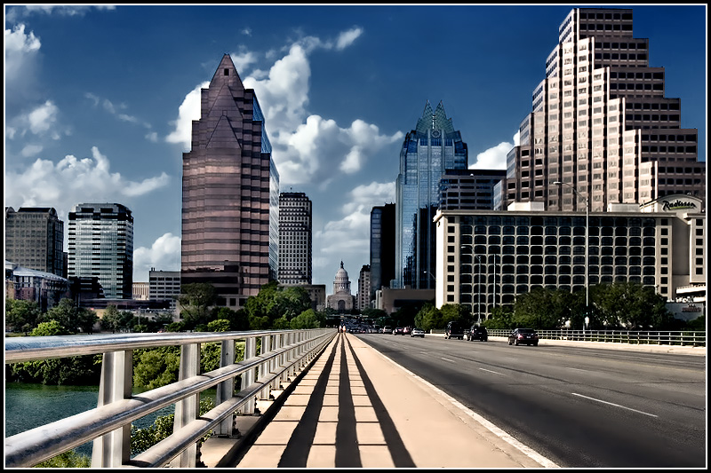
3. Moved the sidewalk and rails slightly to the right to line up better under the capitol building.
4. Curves (auto adjustment).
5. Gradient Map (black & slate color) set to soft light blending mode with a "highlights" mask (i.e. CTL ALT ~).
6. Duplicated Gradient Map layer also set to "soft light" blending mode. This whole effect made the image darker in the shadows allowing the higlights to stand out more.
7. Cloned out a darker/wider shadow on the sidewalk so that the shadows from the rails were uniform.
8. Selective color to brighten the whites. Masked out some areas to avoide blow outs.
9. Shadow/Highlights applied via mask to brigthen some of the shadow areas along the vanishing point axis.
10. Cloned out some sensor dust.
11. Channel Mixer (set to monochrome, gray = 100%) with blending mode set to Luminosity to maintain color. This darken the blues in the sky while brightening the sidewalk putting more focus on the vanishing point area.
12. Gradient Map (black, white color) set to "luminosity". This darkent the shadows more and gave the image more contrast.
13. Curves used to brighten overall image then a mask was applied so that only the rails were brighten. The blending mode was set to "overlay".
14. Duplicated curves layer and set blending mode to normal. This brighten the rails even more.
15. Curves set to brighten the whole image even more. Used a mask to only apply the effects to certain areas of the buildings where I wanted stronger highlights.
16. Channel Mixer, again I used the monochrome setting with gray at 100%. The blending mode was set to "luminosity" to keep the image in color. This darken the sky even more while brightening the lower half of the image namely the sidewalk. The point of all this is to bring the eye to focus more on the lines leading up to the capitol building.
17. Selective Color was used in the clouds to bring out some more detail. I set white to 100% black which darken the whites a bit giving the clouds more depth. This could have been done via the burn tool.
18. Color Balance was used in the sky to get a bluer color. (midtones set to -15, 0, +22).
19. Noise Ninja was used for slight sharpening as well as a contrast boost and noise reduction.
20. Clone tool was used to remove some halo effects resulting from the selective color adjustment I used earlier that the color balance and noise ninja effects have amplified.
21. Shadow/Highlights was used again but with a left to right gradient (white/black) mask so that the effects would only apply on the left side, which is the direction the sun was located. This just made the light direction more apparent.
22. Perspective tool was used to correct the wide angle distortion on the buildings. I only applied the adjustment to the buildings and not the street.
23. Hue Saturation was used to adjust the blues. I set the saturation and ligtness to -100 and then set the layer blending to "luminosity" to maintain the color. This gave the blues a richer darker look.
24. Duplicated the Hue Saturation layer to double it's effect since you can only go as far done as -100 in the settings so this is essentially a -200 "desaturation" & "de-lightness" effect. As I did with the other layer I set the blending to "luminosity" to maintain color. This darken the blue further. The top right corner was getting too dark so I partially masked that out.
25. Clone tool was used again on some of the building tops to remove halos resulting from the Hue/Saturation adustiments.
26. Smart Sharpening was used as a last step then the border was added.
Beautiful workmanship, astounding rewarding result - inclusion of your generous and complete listing of the edit steps is a example for all. A very excellent & enjoyable presentation in all aspects.
This is sweet! I'm surprised I haven't seen it before. Minor thing in addition to what you've already done is fixing the verticals. It's evident in the embankment ;) Aside from that, this is sweet dude!




 Add photograph to your favorites
 Add photographer to your favorites


 Photographer found comment helpful.


