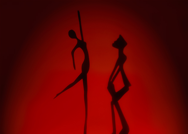
Just two tiny sculptures that I put together. Lit by sunlight, red cardboard is the background. The darkness on the sides was achieved by burning. The drummer was farther away from the cardboard to make the sizes look similar, that's why he looks more blurred.
Statistics
Place: 19 out of 154 Avg (all users): 6.3487 Avg (commenters): 7.9286 Avg (participants): 6.5135 Avg (non-participants): 6.2479 Views since voting: 1621 Views during voting: 333 Votes: 195 Comments: 18 Favorites: 3 (view)
I really like the photo, but i think that the siloetes should be darker. The top of the one on the left is really good. It is a solid black. You could probually adujust the black levels to get the solidness throughout.
First impression and overall look:
I like this image from first view. It is a strong, simple image that invites to take a longer look. There are some small critiques however. The second figure has indeed a softer edge than the dancer. I realise the size difference made this necessary, but it's a shame really. The leg of the dancer is also softer than the rest of the figure.
In stead of having the sun castig the shadows in the red board, I wonder if you wouldn't have got a better result if you used a strong artificial light. Or backlight the figures through a red cloth, to capture the silhouettes.
The figures are also slightly out of centre. This is one image where symmetry would do well, I would personally choose for the empty space between the figures to be the centre of the image.
Technical and post processing:
Not much to say here. Technically all is well. The burning on the sides was a good choice. I do not thing the image would be as interesting without it.
Meeting the challege:
Definitely, and in an interesting way too.
How to raise you score:
Maybe the points I mentioned before would have given you a few extra decimals, which would normally place you well in the top ten. The problem with this challenge was that there were too many others scoring very high, which placed you on the second page.
this is a beautiful and striking image. the red is a lovely lovely choice of colour; it's oddly sexy as well. i love this so much; the shapes, the mood, it's simplicity, it's fantastic application of shadows, everything. a very high quality shot, and deserves to do super-well. 10.





 Add photograph to your favorites
 Add photographer to your favorites

 Photographer found comment helpful.


