|
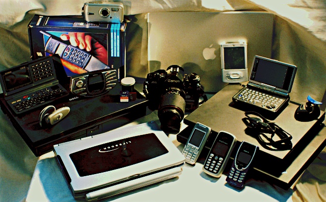
This fits the theme, but the arrangement of so many items just becomes awkward and messy; the objects look like they were arranged for a TV game show, I don't get any sense of strong composition or design in their placement. The harsh lighting and shadows hasn't helped either. I think this is a case of "less is more" - try with just two or three items, in an arrangement that either looks more artistic, or more "natural" like they belong together. |






 Add photograph to your favorites
 Add photographer to your favorites


 Photographer found comment helpful.

