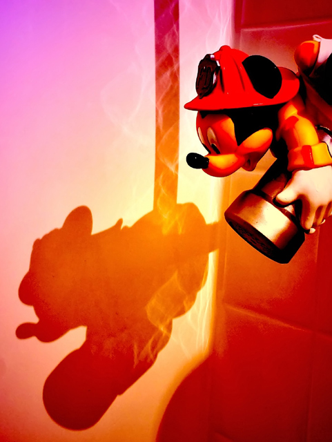
Highly processed. I admit, the colors all came from a Harry's Filters filter. It's a plain white bathtub in real life. But I wanted it to look like he was flying into a fire, and I think I accomplished that. It LOOKS processed, but I think it looks cool. Here's hoping for a >5 score.
No spot editing and only a couple of layers. USM for contrast, etc.
File name
CRW_6167.CRW
Camera Model Name
Canon EOS DIGITAL REBEL
Shooting Date/Time
6/7/2006 22:13:28
Tv(Shutter Speed)
2.5Sec.
Av(Aperture Value)
F8.0
Metering Modes
Centerweighted average metering
Exposure Compensation
0
ISO Speed
100
Lens
18-55mm
Focal Length
28.0 mm
Image size
3072 x 2048
Image Quality
RAW
Flash
Off
White Balance
Auto
AF mode
AI focus AF
Picture Style
-
Parameters
Tone Curve : -
Sharpness level : -
Pattern Sharpness : -
Contrast : 1
Sharpness : 1
Color saturation : 1
Color tone : 0
Color matrix
-
Color Space
sRGB
File Size
5026 KB
Drive Mode
Shooting with self-timer
Owner's Name
Bernard Shuford
Camera Body No.
0560150116
Statistics
Place: 90 out of 154 Avg (all users): 5.3657 Avg (commenters): 7.1667 Avg (participants): 5.3235 Avg (non-participants): 5.3925 Views since voting: 905 Views during voting: 254 Votes: 175 Comments: 15 Favorites: 0
Reading through what you've said, it seems as though you have achieved what you set out to do very well.
The colours and the watery reflections give create the "going into a fire" atmosphere, and the composition seems very balanced. However, if I had seen this in the challenge I doubt I would have voted it high, as I don't really "get it" without the explanation.
Remember, y'all, he's a FIREMAN, flying into a FIRE. Natural colors will not exist in such a situation. That's why I did what I did. Minimal post would have been a complete waste of time. This was what I wanted it to be. Thanks so much for the comments, though, next time I've got to figure out how to make YOU see the reason.
I like the idea, but the colors are a bit over the top for me. I was out fo town and couldn't vote, but I would have scored it a 5 or 6. I would have leaned toward a higher score if the colors weren't so saturated (especially his hat, which has few details).
Trading Post - Reading your intentions on the perception of this shot after the fact helps make the processing make sense. I dont think i got it during the challenge. Pretty funky colors and the shadow really stands out. I am sure it is not what voters were looking for though.
Trading post...
Great job here! After being DQ'd for a filter I'm really leary of using them anymore. This was so creative. IMHO, I think this should have scored higher. And I don't think it looks processed.
Heh! I like this one! I love that you used filters to get the colors - I'd never have known that. Very clever! It looks vibrant and rich, but not overly processed to me. I like how the figure and the shadow are both in the frame, but the shadow more fully developed in the "action" by being attached to the rope. Met the challenge well and would make a nice poster for a kid's room, I think!





 Add photograph to your favorites
 Add photographer to your favorites

 Photographer found comment helpful.


