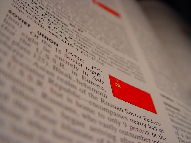
Your focus doesn't seem to be quite in the right place in my personal opinion. I think I would like for it to be a little bit lower, to show more of the SU deffinition in focus. Right now, the def. above is more in focus. I mean, you can still read it, but it's kind of annoying. The color is good, and I like the tilt of the photo. The angle and fill the frame framing are nice. Focus is really nice, but to me, in the wrong place. Overall nice. ~Heather~
I can see the point with the DOF here, but I really don't like the effect it gives: somehow it pulls my eye away from the obvious subject toward the out of focus lower left area - have no idea why that it, but it's what happens. Can't see a good reason for not having the entirety of the flag image in focus either. Not bad work, for all that.







 Add photograph to your favorites
 Add photographer to your favorites


