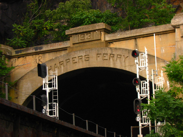
Difficult to comment, since I know who took the pic... I think you should have been a bit to the right so the left signal light doesn't cut off the H in Harpers Ferry... overall, however, an appropriate shot.
Seems like there is a slight tilt to the left. Would have also appreciated space preceeding the H in Harper as there is space at the end of the lettering. Otherwise nice pic - one of my top picks.
Its too bad for those dang railroad lights. Well since ya can't take those things down to easily maybe just try moving a litttle bit over to get that "Harper's Ferry" a bit more centered between the posts and not crowded off as much at the left end, IF possible..
Good composition, good use of colors, nice perspective. Unfortunately the picture gives a sense of being off balance because of the white pole on the right. Good job.






 Add photograph to your favorites
 Add photographer to your favorites


 Photographer found comment helpful.


