Intended to be a simple reshoot of my first ever DPC entry, this turned into quite a nightmare. Reduxing Time of Death with a Rebel kit lens - no true macro capability - was not easy. I have obviously NOT improved as much as I would have liked in three plus years.
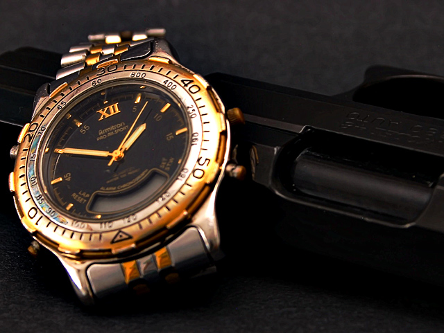
So, I completely recomposed, used a long shutter and multiple flashes in a dark room, and processed the dickens out of it. I think it will score much worse than the original, but who knows.
Thank goodness for advanced editing. However, recreating the steps will be difficult if required. I do have the PSD file with layers intact, and there's a USM for contrast adjustment. Minor cloning for hotspots from the long exposure.
File name
CRW_6164.CRW
Camera Model Name
Canon EOS DIGITAL REBEL
Shooting Date/Time
6/5/2006 21:19:14
Tv(Shutter Speed)
25Sec.
Av(Aperture Value)
F8.0
Metering Modes
Centerweighted average metering
Exposure Compensation
0
ISO Speed
100
Lens
18-55mm
Focal Length
55.0 mm
Image size
3072 x 2048
Image Quality
RAW
Flash
Off
White Balance
Auto
AF mode
Manual (MF)
Picture Style
-
Parameters
Tone Curve : -
Sharpness level : -
Pattern Sharpness : -
Contrast : 1
Sharpness : 1
Color saturation : 1
Color tone : 0
Color matrix
-
Color Space
sRGB
File Size
5115 KB
Drive Mode
Shooting with self-timer
Owner's Name
Bernard Shuford
Camera Body No.
0560150116
Statistics
Place: 108 out of 161 Avg (all users): 5.5769 Avg (commenters): 5.2000 Avg (participants): 5.4444 Avg (non-participants): 5.6667 Views since voting: 900 Views during voting: 225 Votes: 156 Comments: 12 Favorites: 0
I have a hard time seeing the gun because it matches the background color so much. The watch is much better, but it suffers from some out of focus portions. I was out of town and could not vote, but I probably would have scored this a 5 or 6, pretty much like most people. I like the idea well enough, but the lighting and focus just don't allow you to quite carry this off IMHO.
being from Iceland were handguns are illegal and nobody likes them, I just can't like them either ;)
but as an image I think the gun needs more light and the watch needs less light, shooting jewlery and watches is really difficult, there are so many shiny places that point in different directions so you'll usually get burned out spots, the gun however is very dark and matte, and needs a lot of light to shine.
putting those 2 in one image shows courage, but I think the lack of studio experience shows in how the image is lit.
Trading post...
Boy, this score must have depressed you. I think it really is a good shot, just not technically "perfect". Guns don't seem to score real well here anyway. I like how the gun seems to blend well with the background. The brightness of the watch is good. The focus seems to be a little off on the watch though.
First off - Welcome back to the fold!!! We have missed you. Now on to business. I scored this a 5. I didnt look back at the original, but I think this would have been better had the whole watch face been sharp. The color on the watch looks good and on my monitor I can see the gun just fine. I guess it is just the concept that left me a bit flat - just didnt grab me.
Quick comparison to original - I think your postprocess work was better on this one but theconcept was better on the original. Hope any of this helps.
First of all, I must be really inobservant 'cause I gotta admit, I didn't notice the gun in either entry for a long time.
Main critiques on original (from commenters) too dark, focus issues, DOF
What you've improved moving the gun from being a reflection to being behind the watch has helped with focus (although tbh I disagree with the orig commenters - I actually liked the OOF reflection because it was suggestive but took some thinking to realise it. Exposure overall is much better. Whilst the focus on the watch is better than in the original, you still suffer from a shallow dof and also seem to have focussed too high up the watch (focussing in the middle would disguise the shallow dof more).
What I prefer about the original Whilst its a tad too dark, the black background really enhanced it, and you've lost that in the take two. Also, the tighter crop on the watch made it seem more oldfashioned, which I liked. (although I understand your lack of macro capabilities)
Overall, imho Whilst you have tackled some of the technicalities of the original, I think you have sacrificed the mood of the original.
i didnt see your initial shot of this one... so i cannot judge that.
i personally think it would be better ifn you had smoke rolling out of the barrel of the gun behind the watch. that would be more indicative of an actual shooting in my opinion. with the watch would have given time of the shot...... time of death.
Composition/subject - Have to say I like the composition of the first one better as far as uniqueness (though it did take a minute to see it!) but the overall composition of this works just fine, too.
Technical - I like the contrast of the "shiny" watch against the "matte" of the gun surface, but would prefer the whole watch face in focus. I'm not sure why you used several flashes and a long exposure - to avoid glare, maybe? Dark background is OK since it has a diff texture than the gun and in a way almost conceals it, which to me relates back to the original a bit.
Meets challenge - Yep, and I like that you tried a different take on it, too.
My opinion - I gave it a 6 in voting. Have to admit I didn't know what the original was, but I think the score here is actually better despite being lower simply due to a "shift" in voting and competition since your first one was entered. I'm not all that fond of guns, or how frequently they seem to appear in pictures here, but I try to not let that influence my impression of a picture.
In a photo like this (IMO) the focus works best if it's brilliantly sharp. The edge of the watch closest to the camera is just outside the DOF region of perfect focus. Better (again IMO) if the part you see most clearly were what was in perfect focus. Also, the handgun and backgrown are nearly equally dark and thus blend into one another. Better (IMO) to bring up the brightness of the background just a bit to provide clearer context.
The symbolism is flawed, surely? If the watch was damaged by the cause of death stopping at that most significant time, so be it. But the photo does not seem to show any damage. Hard, therefore, to suspend disbelief.





 Add photograph to your favorites
 Add photographer to your favorites

 Photographer found comment helpful.


