my first submission on this site spoiled me. i scored a 6.7 for 4th place, and am now striving for a 6 in each challenge. i\'m finally getting my style together and am able to achieve close to 6 every challenge.
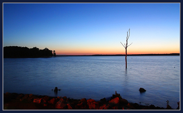
the first night i went, the lighting/sky sucked. it was so blue, no clouds or anything interesting. the second night was this one, and the sky was beautiful. i hope i get in the top 10 again with this, but if not i\'ll still be happy with it.
thanks to everyone\'s help, and good luck to everyone that\'s entered the challenge.
here is my original 4th place finish, from the branch challenge.
i personally like the newer one the best, because of the bright, vivid colors. i'm very happy with the outcome of both of these shots, and am very thankful for the wonderful comments left by you great friends and fellow photographers.
-Jon Rowe
Statistics
Place: 48 out of 161 Avg (all users): 6.2595 Avg (commenters): 7.0000 Avg (participants): 6.1406 Avg (non-participants): 6.3404 Views since voting: 1269 Views during voting: 243 Votes: 158 Comments: 8 Favorites: 0
In line with the challenge, I have looked at the original image too, which I loved by the way;)You have produced two wonderful images that would grace any wall;)
This retake has a totally different feel due the different lighting conditions; your first one having lovely soft orange hues and tones, and this one those gorgeous blues. The line of orange/yellow/red on the horizon contrasts beautifully against the blue, and is picked up in the rocks in the foreground.
The composition is a bold choice as you place your horizon in the middle, cutting the image in two. I am wondering if you did this to avoid replicating the first image too closely? I would have loved to have seen the horizon placed higher as in the first one. The horizon also looks a tad off to me, which seems to emphasize the cutting in half element. Don't get me wrong, it's lovely as it is, but I think the colours were different enough for you to get away with copying your other image's placement of the horizon,and perhaps have upped your already excellent score;)
The tree is wonderful and dramatic, I just wish it were a little closer to the foreground and filled the frame more, I guess I'm just greedy;)
You're obviously an expert at finding the right aperture and shutter speed for these lovely evening shots, and the image is clean and crisp.
Don't know the original so I don't know wheither you did better or worse.
Colours are good but it is a bit irritating that the tree bends at the horizon. Using rule of thirds I would have preferred to have the horizon a bit lower or higher, not in the middle of the picture. That is just me!





 Add photograph to your favorites
 Add photographer to your favorites


 Photographer found comment helpful.


