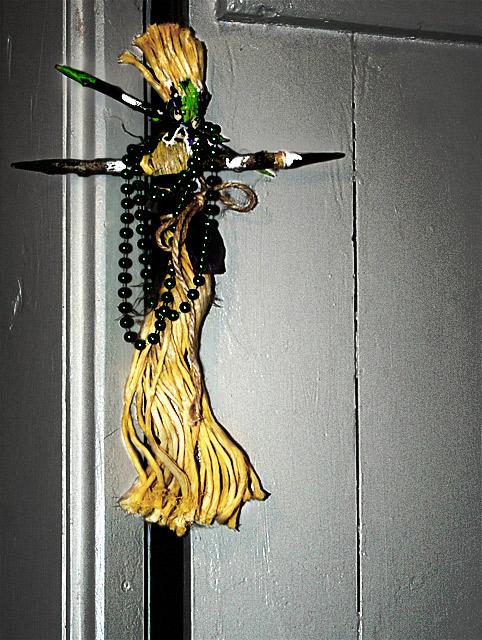
the only comment was to fix the white balance, but I played with merging layers using hard light to put more emphasis on the subject. I also cropped closer, but still off center. It won't be hard to beat the original score!
Statistics
Place: 158 out of 161 Avg (all users): 4.2956 Avg (commenters): 3.0000 Avg (participants): 3.9365 Avg (non-participants): 4.5313 Views since voting: 1464 Views during voting: 223 Votes: 159 Comments: 7 Favorites: 0
Looked at this one and the original. The lighting in this one is rather flat compared to the original. Yes, the door is now white but you are missing the interest of the shadows that was there before. I think the closer crop would work well if you still had the same lighting as before. I actually liked the colour in the original better too because the green of the beads showed more, but that's just me.
The light is a bit harsh (flash?). Also, the background doesn't add anything to the pic - actually I find it distracting. Had you chosen a pure white background this might be very nice.






 Add photograph to your favorites
 Add photographer to your favorites


 Photographer found comment helpful.


