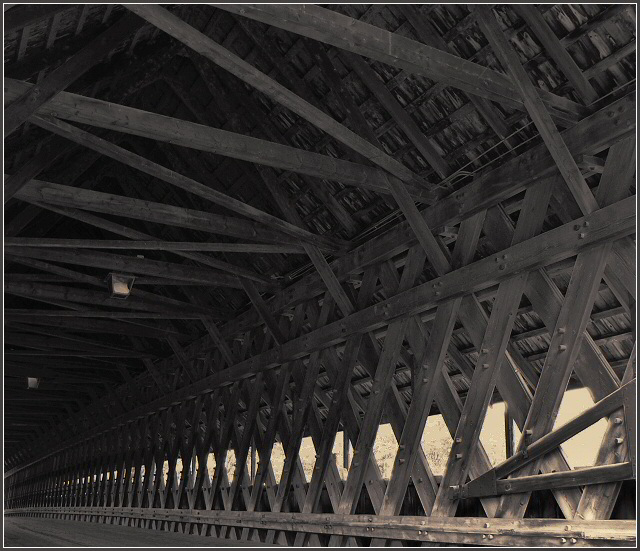
This is a very different take on the subject. I like the dark, brooding feeling and the well captured shadow detail in the roof. On the other hand, I really liked the textures and lines of the original. They are really two very different pictures!
This is a big improvement compared to your original. The biggest difference is the loss of the beam in the foreground. I like what you did with the color.
The highlight on the wood in lower right is nice, but the open space looks a bit blown out.







 Add photograph to your favorites
 Add photographer to your favorites


 Photographer found comment helpful.


