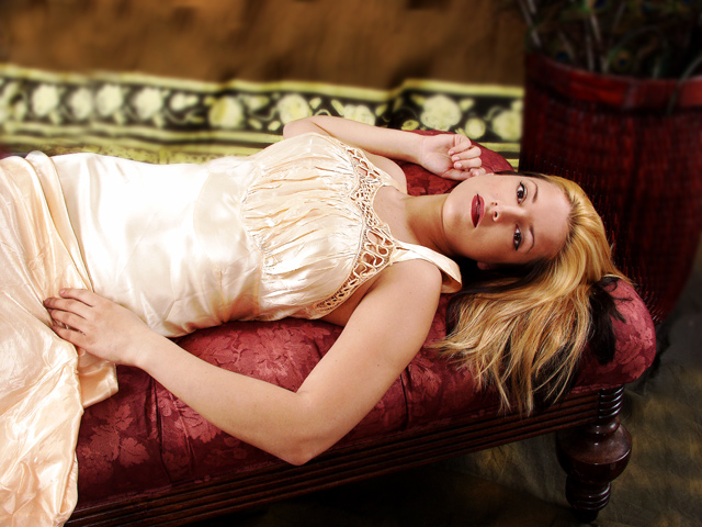
The main thing that bothers me about this shot is the camera position. At this angle, it appears that her feet would be elevated above her head. This gives it a subtle feeling of tension that seems out of place. I tinkered around in Photoshop and rotated the image 25 degrees CCW. This put her in a position where her feet would be in a slightly lower than her head and gave it a much more relaxed feel.
So I placed at 25% up with photo angle, it did not work to rotate photo from other angle was strange.
On the negative, the hair could use some more definition/highlights. That dark patch is a bit distracting. Maybe have a dedicated light to bring shine to that part of the hair? Also, her outfit looks very wrinkled. Not sure if that is just the look of the garment or not. Regardless if it was smooth I think it woudl have really enhance the shot even further, IMO.
It is a wrinkly garment but I smothed out where I could. Less contrast.
Statistics
Place: 29 out of 161 Avg (all users): 6.5090 Avg (commenters): 7.6818 Avg (participants): 6.3571 Avg (non-participants): 6.6186 Views since voting: 3806 Views during voting: 525 Votes: 167 Comments: 27 Favorites: 1 (view)
I think you photograph is well done technically and I like that you have opened up the crop on take two over the original. The eye contact between the model and camera is great and the focus is good. The bottom half of her body does seem a little uncomfortable but the rest of the pose is great. I do think the background is a bit distracting with the line or border at the bottom going straight through her arm. I feel it would of been better if the dark portion of the background would of continued all the way down to the model.
Overall a very good setup and technically sound. A few distracting elements eliminated would of made the picture great.
I hope you find this critique helpful and if you have any questions feel free to contact me.
Wow Chris. Her hair is blondier this time around ;) The focus here is great. Much better than the first one. However, I still seem to prefer the tigher crop of the first one than this. The skin tones are natural and great. The softness of her skin radiates well. (7)
BTW: This has got to be the longest title ever on DPC :P
Glad I remembered to come back to this one. I am bumping back up to the original score i had given you. I dropped it down to a 3 after my voting finished because of the long title splitting my screen. Took me a bit to figure out what was doing it. So bumping up 4 points right now back to a 7. Good shot with nice colors and DOF. Good job
A really nice overall improvement. I like the composition more and the colors look better. Scored it down a point because of the destracting blown highlighs in the torso area of the nightgown.
i am sorry but I like your first one better. don't get me wrong this one is good too but the 1st doesn't have the distracting rug. I think I also like the close up it emphasizes "the look" better.
This is 10 times better than the original. i remember saying at the time that i thought she had an awkward pose...this is spectacular and has met the challenge well by making an improvement...this is stunning and spectacular and one of the best portraits of it's kind I have seen...it's going into my favourites...deserves a ribbon 10
This is a huge improvement over the picture in the link you provided. :-)
Love the Victorian slashed with modern feel to it.
One nit pic I found was where the blur meets the arm, some of the dress and a part of the furniture piece she is on. You can see where it was added in. The blur does look convincing in the other parts, but could have been overally believable without these few spots.
This is absolutely exquisite. I'm not even going to bother looking at the former. This is a perfect 10 in every aspect of the word. The lighting, the color, the pose, the content, the clarity. Man - just an EXCELLENT capture. Congrats - go have a beer!!!






 Add photograph to your favorites
 Add photographer to your favorites

 Photographer found comment helpful.


