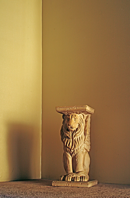
the lack of the empty room feeling makes this image bad for the challenge, to use a wider lens and skow more of the room would have been much better.
the framing of the room is good, the statue should have been a bit further to the right, just to give the image a rule of third composition.
lighting is a bit harsh, the dark shadow is not helping the image, if using tabletop lamps for lighting try to stretch a white cloth, bedsheet or something and shine the light away from the subject onto the white cloth, that way you will get a much softer light, and it will be much whiter to.
Trading post...
I didn't vote in this challenge but would have given it a 5. It really doesn't seem to convey the empty room part. Technically it seems a good picture.
I gavethis shot a 5. It met the challenge but probably not in the way people were expecting - more room would have helped. The setup is fine and the detail on thelion is good. The colors seem a bit flat or boring and the picture overall didnt grab my attention. I think that is what kept me from voting it higher.
Composition Love the composition of this one, following the rule of thirds. The placement of the pedistal is just right
Technical stuff (exposure, dof, lighting etc…) I like how the 2 walls are different shades because of the lighting, and the shadow of the pedistal parallel to the back wall.
Although I like the warm tones, it does seem as though the WB is a touch off.
Meeting the challenge It doesn't not meet the challenge, but not give a bit of an impression of "I'm not emptying a room just for dpc, so here's a corner". :P It would have seemed more appropriate with a wider angle (but I'm assuming there was stuff in the way)
My personal opinion I was surprised that this didn't score higher - I think it would have done better in a different challenge, because its a great photo, but doens treally say "empty room" but rather "empty corner". Guess its hard to compete when some people are dedicated enough to dpc that they'll empty a whole room for a photo lol.
This feels rather "plain", but that could also be defined as "empty". Using something with more color, as opposed to creating a monochrome look, would probably have been worth a half point or more. It almost has a color cast to it, but I don't THINK it's a white balance thing. Just a low contrast pic. More contrast, from lighting, color, and post processing, would have helped, IMHO. :) Keep shooting!
my first thought is that it is very bland. i didnt enter this challenge cause i could not think of a way to get lights and colors in the scene with what i have on hand.
i think you need to add gallons of contrast and go B&W to get this one to perform moderately. some creative lightfall on the pillar maybe with the window instead of the corner would have been better.
i am unsure about any of this. was a difficult challenge.
Composition/subject - This may sound weird, but it looks a little cramped for being an empty room shot. I think the statue needed to be a little further out into the room, and further away from the corner. It seems a little "top heavy" as it is shot now.
Technical - I really like the quality of light used and I like the monochromatic color scheme. This does limit the contrast you can get, though.
Meets challenge - Pretty much, but as I've noted above, you might have needed to show a bit more "empty room".
My opinion - Like the color scheme and the light, but the composition needs a bit of work.
I like the tone of your photograph and the lighting is good. Your crop of the room is to tight, IMO, not giving me the sense of an empty room. It's like I could look to the left or right and see a sofa or chair. The Corner of the room (vertical line) is stronger to me than the subject. I find my eyes homing in on the line.
I don't know if you were able to, but I feel the statue would of been better placed in the corner covering up the most of the corner line and then doing some burn to take down the highlights on the line above the statue. And maybe a little more sharpness on the statue would of helped.
With all that said I feel your photograph is good and with a few adjustments could of been better. I feel you did meet the challenge even though the crop is tight. Keep up the good work and I wish you well in the challenge. 5
a well exposed image, but it just feels... empty. yeah, i know the challenge is empty room, but others feel filled with emptiness, while this one is just ...empty. i'm sorry, this makes no sense, does it?
i think this might have benefitted from a wider angel to have more room init, or a landscpe format, to emphasise the emptiness. i think that the expanse of wall is rather heavy on hte pedestal.





 Add photograph to your favorites
 Add photographer to your favorites

 Photographer found comment helpful.


