Ok, I dig how you exposed the room, even with the blown window... works for this shot...
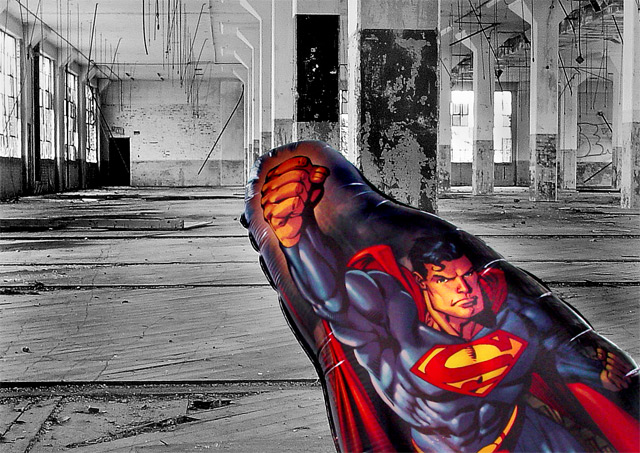
I have some problems with the balloon though...
Low saturation is one thing... for good juxtaposing, I would have pushed the blue up a fair bit...
I'm having troubles with the graininess of it though as well as the fact that it looks a bit soft... with 0.3s shutter time and your comment on 'wind', I'm going to hazard a guess that it's movement rather than focus...
The biggest issue I have is the composition... I just plain don't care much for the way that Supe' is lined up... I might have liked him better on the left where he has more contextual interaction with the iron spikes coming down from the ceiling and balances the pic out against that bright hotspot in the window...
Thanks for all the great comments. Please continue commenting pros/cons, that is invaluable to all challemgers.
I agree, the baloon, stands out like a bank robber with a clown/president mask. That was intentional, may be disturbing to some.
Yes, it is in the same room as mentioned below. Metatate and I went on a before day-job, photo expedition.
The contrast is called juxtaposition. "A side-by-side comparison...of similarities or contrasts", according to the dictionary. I really would like some input, a comparison of this one and the ribbon holder, who also had a juxtaposed shot with an umbrella, and a warmer-toned room.
As always, some of my outakes may have been better, I will update my portfolio soon. If anyone uses baloons keep the wind in mind it makes them "fly".
First of all, congrats on your second highest scoring entry to date.
Camera Work/Technical: Great focus and nice depth if field use. You also did a very nice job with selective desaturation to yield a very interesting image.
Lighting: Very nice and very even. There are no areas that were lit to the point of distraction, nor are there any harsh shadows that are overly distracting.
Composition/Content: I do like the composition that you chose, but I don't see how the elements play together. Your positioning of the balloon is positioned well to draw the viewer into the frame, but the coloring is a bit overpowering, thus competing for the eye's full attention.
My Opinion: Nice job meeting the challenge, and I think that this one scored pretty close to its potential. With a different foreground subject, this one might have done a bit better. You have a great empty room there for a great start.
Looks like same rooms as "sign of life", maybe related members or DPC friends? Let the balloon fly around and it will soon destruct on one of the many rods hanging down ... I do like the picture, and it meets the challenge.
Great job all around the photo captures my attention and retains it. Which usually would be a good thing except that "Superman blowup". :P Really I wish you would of used a prop that along with the theme of the photo and the processing. I'm not going to knock you for having a bad prop (at least it shows you put something in the room) But I would love to see this photo retaken with the same editing with a corresponding prop. I believe it would be great. 7
This is a great empty space and good use of B&W. I'm not sure about the balloon though. Something a little 'darker' in meaning would have been stronger for me.
Wow! Great choice for the emptry room portion of the challenge. Not sure I like the Superman Balloon as the subject. I would have used a colorful beachball and titled it "The Grand Ballroom". :) Great job on the selective desaturation. I like it!
The desaturation works well. The balloon looks like it's ripping through the frame. As a creative excerise this is really good. I kinda wish there was more to the story here so maybe next time whip up some graffiti on that left wall to help with that. :P






 Add photograph to your favorites
 Add photographer to your favorites


 Photographer found comment helpful.


