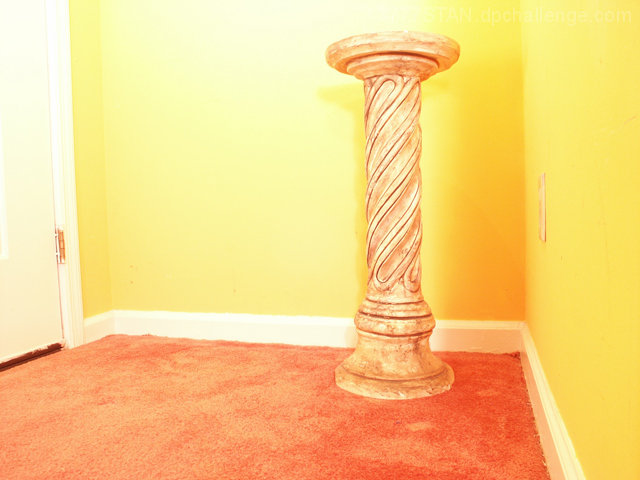
Resized: Used two continuous flood lights with simple 60 watt incandescent bulb instead of a studio-rated variety and one mirror to highlight the pedestal. I chose a low-angle placement of my DiMage on a $5.00 Shirt-pocket-clip mini tripod positioned on top of a four-legged footstool. Purpose: to test angle, lighting and parellax lines ability to create the illusion of expanse in a small space.
Statistics
Place: 102 out of 114 Avg (all users): 4.5519 Avg (commenters): 4.3333 Avg (participants): 4.2222 Avg (non-participants): 4.6923 Views since voting: 858 Views during voting: 362 Votes: 241 Comments: 19 Favorites: 0
Not sure why the title has to include the second part after the colon. Makes no sense.
Note to Alienyst (as well as everyone else who thought it without saying it): "I am sorry for any possible offense that this cryptic title may have caused. Just the opposite was my intent. I hope this clears things up because I Put D.P.Challenge Up On a Pedestal since I have been helped already in myriad ways! Thanks Loads, Guys!"
The best way to describe my "brain-wiring" is Free Association Picture Thinking. That leads me to my rather cryptic title. I appear to have written it in Jeopardyze. "The answer is 'A Place For Inexperienced Photographers To Display Gratitude For Their Improved Skills.'" My response would be, "Alex, the question is 'What Is The Pedestal: Default Storage For D.P.Challenge?'"
I hope & pray that I did not "burn out too many brain cells" in the minds of the very photographers to whom I was trying to give a High Compliment...in my mind at least. :) Stan
Initial thoughts: Very bright, nice idea and it meets the challenge.
Visual appeal: I like the colors, and I've noticed that some people have mentioned oversaturation, and the colors look a little oversaturated in some places and somewhat washed out in other places. The room has a clean fresh look to it and the pedastal is a nice subject.
Subject & background: The door is distracting and then upon further inspection, so is the electrical outlet on the right side wall. This was an advanced editing challenge, so the outlet imo is a small enough element that could have been cloned out.
Angle, framing & composition: now, for this shot, I would try a vertical orientation, because it would both cut out the door and add some much needed space above the pedastal to give it more of that "expanse in a small space" feel you were going for. I would also pull the pedastal out from the back wall a bit to give it some more space. I think that you did a great job balancing the photo as it seems very level to me.
Focus, clarity & DOF: The focus seems to be pretty good, you might try selectively sharpening the pedastal (since this is advanced editing) to really help bring it out against the yellow wall. I like how the rest of the photo has a kind of soft glow to it.
Lighting & exposure: I think that you did a fairly good job at lighting the area --I see some shadows behind the pedastal and a slightly blown out area above it-- but for a very pale pedastal on a yellow background, I think that you could have used the shadows to your advantage. I think that maybe you could try messing around with pulling the pedastal out from the wall a bit and try casting a sharp shadow to add interest and depth to your photo and also bring it out from its surroundings. Also, you could try some moody, dramatic lighting, maybe a single spot light from above. Just a few suggestions :)
Post processing: This photo doesn't seem to have any obvious editing errors. Like I said earlier, I would try selectively sharpening the pedastal and cloning out the outlet. You also might try messing with contrast to see what you get
Overall, my opinion: I think you have a great idea going here and I would love to see you try this shot with different types of lighting and different lighting techniques to add some more interest. I also wanted to say that I am also confused by your title, I'm not sure how the pedastal is DPC's default storage... but overall, nice job, glad to see that you are experimenting with mirrors and different lighting placements
If you have any questions regarding this critique, feel free to PM me
Lighting made this a lower score than it could have been. Using light to isolate the pedestal from the wall and floor would have made this more dramatic.
i don't like this. the colors, the lighting, the processing. but, as long as you do, that's what matters. (i'm just commenting, not voting, so feel free to ignore my opinions).
Great idea but I would have tried this one in BW since the uneven yellow (due to flash) isn't too pleasing for my eyes. A tripod and no flash would maybe also have worked better.





 Add photograph to your favorites
 Add photographer to your favorites


 Photographer found comment helpful.


