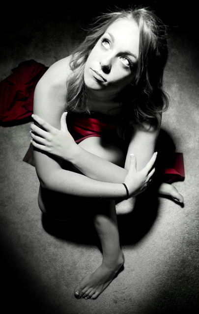
Wow! This is simply wonderful. The dash of scarlet makes it even more interesting. Framing and lighting is just fine. The photo is overexposed or blown out at points, but it fits the overall composition. The focus seems to be little soft though.
A marvelous composition. Wonderful perspective and pose. Subtle use of selective desat. The only defect is the face is slightly out of focus, but perfect otherwise.
So, "Jasmine" is one "thing" - nice thing, I would say, think her expression is too constructed, but I do like the picture, color composition and lighting.
Ok keeping it real here. I really like the process done to the model. But front leg seems out of touch and place. Seems painfully out of shape with the remaining subject and dark compared, even though the other foot is light. The spotlight effect works real well but the crop IMO is to tight to justify an empty rooms theme. I'm not saying it does not meat the challenge but what I am saying is you didn't show me enough to get the feel of an empty room. If you could of taken the picture with a wider angle of the room and the spotlight effect on your subject as you have done I feel it would of reduced the front leg issue and opened up the photograph to give me the feel of an empty room. I also wish the title would of said something more about the picture than just the models name. I feel she has something on her mind as she stares upward. A different title may have given a better picture to viewer relation emotionally.
Overall a good shot that could of been better without the tight crop showing more of an empty room. The processing is great on the model but the venting is a little strong. Good Job and wish you well in the challenge. 6
I like this pose. She is sitting there under the spotlight looking up at whoever is looking down at her.
I'm not a fan of selective desat; I find the red drape distracting.
Finally, I don't see much of the room. If I were selecting photos for a "objects in empty rooms" show, this is not one I would pick.
Good angle for a portrait, but I do not feel the emptiness of the room because such a small part of it is shown. The title doesn't refer to the theme either, so it's hard to make the connection.
Oh Dear this is way to contrasty and the pose is very awkward, I think you need to diffuse or feather the light source or at least it needs 2 stops less exposure IMHO 3
Lovely model. Her face it just a bit too harshly lit for my liking. The pose is unique, however the strange angle of the left foot on the bottom is distracting.
Great image. I would count this as 2 "things", the person and the scarf. Plus I don't get much of a sense of the room. This will probably do well anyway.
I like the lighting and single sat of red, but I don't get the sense of an empty room. What if you backed up and had her in the corner, so we could see the walls and lack of furniture in there? Just a thought.




 Add photograph to your favorites
 Add photographer to your favorites

 Photographer found comment helpful.


