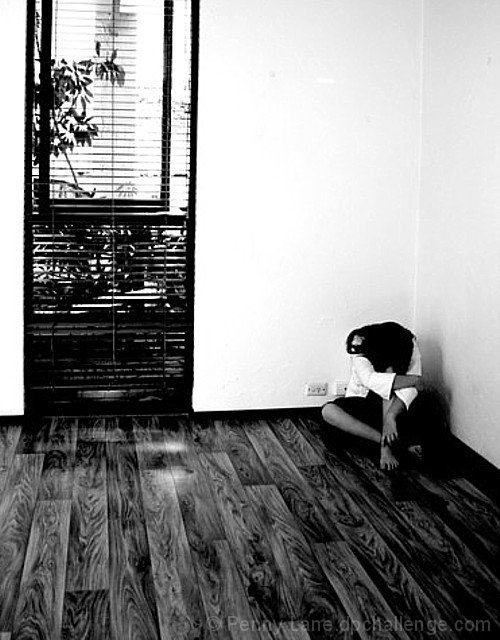
I like your choice of subject matter for this entry, and your choice of post-processing in B/W. The faceplates on the wall next to the subject are a bit distracting but not sure how you could get around them. Maybe since it was advanced editing they could have been removed as a distracting element?
Starkness of th eexposure suits the mood of the photo well. Did you consider blurring the stuff showing through the opening? There's a lot of detail there, and it fights for attention with your subject.
A little too contrasty (there is no detail in the darks) but nicely composed. I do not feel the emptiness of the room because such a small part of it is shown.
your subject blends into the floor a bit too much. also, i'm not much of a fan of standing eye-level perspectives. it's just too easy to hold the camera up to your eye and click.






 Add photograph to your favorites
 Add photographer to your favorites

 Photographer found comment helpful.


