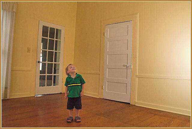
One precious thing in an empty room. At max 640 pixels, I assume that is why some edges are saw tothed, and also I would have liked the wall intersection to have made up the alingment of the photo. Skilled model!
Ok keep it real here. The photo is not bad but I have a few issues with it. The main one is the horizontal line that bends and goes down to the child's head. That is very distracting. It also, with the bend, ends up almost in the center of the picture make the picture look like it is split. I think, in this photo, black and white or some other duotone would of worked better than the colored version. Everything from the child, floor, walls, and doors seem to have the yellowish tint. And the border does not do anything to help that. I think maybe positioning the child near the glass pane door with a reflection or shadow coming it would of helped. With that said you did meet the challenge.





 Add photograph to your favorites
 Add photographer to your favorites


 Photographer found comment helpful.


