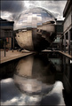
Tried to get a better contrast, also a bit more of image...
Responded to the "best" critique I had on the original.
This will be a case of "the original thing did better than the sequel" I am sure...
POST CHALLENGE
Thank you all for your votes. It did better than the original and that is great! I want to thank all who commented on the first take (and all other entries as well), you guys really helped me improve. A big thank you!
Statistics
Place: 13 out of 161 Avg (all users): 6.8210 Avg (commenters): 7.6154 Avg (participants): 6.5714 Avg (non-participants): 6.9798 Views since voting: 2127 Views during voting: 239 Votes: 162 Comments: 17 Favorites: 3 (view)
Great piece of graphical art. Photographically there is not a lot more you do with this. People will either love this or hate it. I am in the former camp. Good shot.
Nice work Pedro. I like the crop on this one better. More interest here.
I know one of the comments was to boost the saturation, but I think you went a little too far.
I like the composition and the colors work really well together. There's a bit of distracting reflection in the purple and red, but it's not too bad. Good job.






 Add photograph to your favorites
 Add photographer to your favorites


 Photographer found comment helpful.


