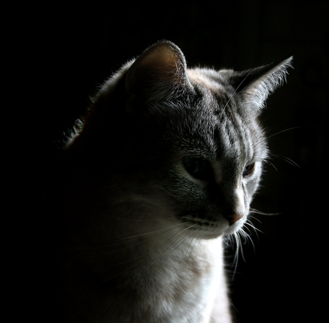
Reshoot of my wildly colored original high contrast cat image that hurt your eyes to view...a little tamer image this time...my cat, with subdued backlighting and sidelighting...cropped, levels, unsharp mask, channels, brightness/contrast
Statistics
Place: 49 out of 161 Avg (all users): 6.2500 Avg (commenters): 7.6429 Avg (participants): 6.1642 Avg (non-participants): 6.3093 Views since voting: 3965 Views during voting: 226 Votes: 164 Comments: 19 Favorites: 1 (view)
A very nice portrait - the low light approach really highlights the fur well, and the lighting on the nose is perfect! Especially well done given the longish shutter speed - hard to get cats to sit still for that.
Camera Work/Technical: I see the main focus is one the eye that is in shadow, leaving the bright light a bit soft. I'd like to see that reversed, and even a slightly deeper depth of field.
Lighting: Your lighting is the main strength of this image. You did a very nice job with limited highlights to create a great low key image.
Composition/Content: I like the composition that you chose here. It has a nice centered profile feel to it that really works for this image.
My Opinion: This one is hands down better than the original entry. The first one lost the feeling of a photograph. This is a nice animal portrait, even though I am not a cat person. Well done.
So you toned down the contrast eh? :P To be honest I don't think this would have worked well as a high contrast image if this was resubmited in that challenge but it would get high marks from me in a low key challenge. As for the image itself, I like it. The lighting is good. Maybe a hair blown out in some spots but it's not much of a distraction.
The only thing I'd like to see improved here is to include more detail in the cat's eyes or at least one of them. If there is some existing detail here in the shadows then maybe dodging the eyes would bring them out just enough to provide a bit of a glimpse.






 Add photograph to your favorites
 Add photographer to your favorites


 Photographer found comment helpful.


