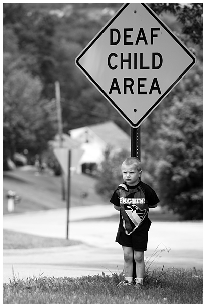
Same kid and location as the first one - new camera, lens and a bit more experience. The original comments suggested de-clutter the BG, see the subject's eyes, lose a tree on the right and add a bit more contrast.
The first take on this is my highest finishing entry, % wise. Lets see how I do this time...
Shot in RAW, converted to b&w and some contrast adjustment and sharpening in RAW in DPP, convert to JPG and in PS resize, curves for more contrast, sharpen, resize canvas for the whtie border, save for web.
Statistics
Place: 69 out of 161 Avg (all users): 5.9264 Avg (commenters): 6.6667 Avg (participants): 5.7273 Avg (non-participants): 6.0619 Views since voting: 1556 Views during voting: 263 Votes: 163 Comments: 10 Favorites: 0
definitely a better execution than the first one but i think the pose of the first one got you the higher score. it was more emotive, i beieve. i really love the emotion behind both of these photos though... this is something i've never seen before... a sign like that... and it almost makes me want to cry.
I prefer this version over the original. The boy has a sense frustration or longing in his face that makes it all the more powerful. I hope this does better for you. Well done. Edit - bumping up.
The composition and tonal range are much improved in this one. I do like the child looking down in the first one, to me it adds to the feel of him being secluded, if you will, by his implied impairment. But I know how children can be difficult at times. :-) Well done overall.







 Add photograph to your favorites
 Add photographer to your favorites


 Photographer found comment helpful.


