| Author | Thread |
Comments Made During the Challenge  |
|
|
06/11/2006 02:36:20 PM |
|
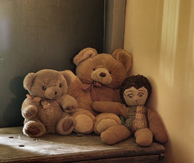
A much better job this time! I like the light coming in from the left across the top of the table, which gives a twinkle to the eye of the first bear! |
|
 Photographer found comment helpful. Photographer found comment helpful. |
|
|
06/10/2006 07:44:41 PM |
|
| Photographer found comment helpful. |
|
|
06/09/2006 07:53:13 PM |
It wasn't able to find the original until you posted in the forum.
Yes you have improved it a bit but there are still things that could be better.
I like the colours better on your previous but this one is better lit.
I like the background better on your previos if you skip the clothing in front.
The wooden thing under is ok, but the walls are distracting because of they are made of three different colours and textures. One thing is for sure, you have made it much lighter and in good focus. Bumping up a bit cause I found your original and could make the comparison :-) |
|
| Photographer found comment helpful. |
|
|
06/08/2006 12:43:19 AM |
|
nice composition, but all of the browns seem to blend. |
|
| Photographer found comment helpful. |
|
|
06/07/2006 03:38:26 AM |
|
This is a cute picture but the lighting seems a little dark with what looks like flare on the upper left. 5 |
|
| Photographer found comment helpful. |
Theme:
Classic /
Light /
Dark
Home -
Challenges -
Community -
League -
Photos -
Cameras -
Lenses -
Learn -
Help -
Terms of Use -
Privacy -
Top ^
DPChallenge, and website content and design, Copyright © 2001-2026 Challenging Technologies, LLC.
All digital photo copyrights belong to the photographers and may not be used without permission.
Current Server Time: 10/18/2026 06:26:49 PM EDT.





 Add photograph to your favorites
 Add photographer to your favorites